
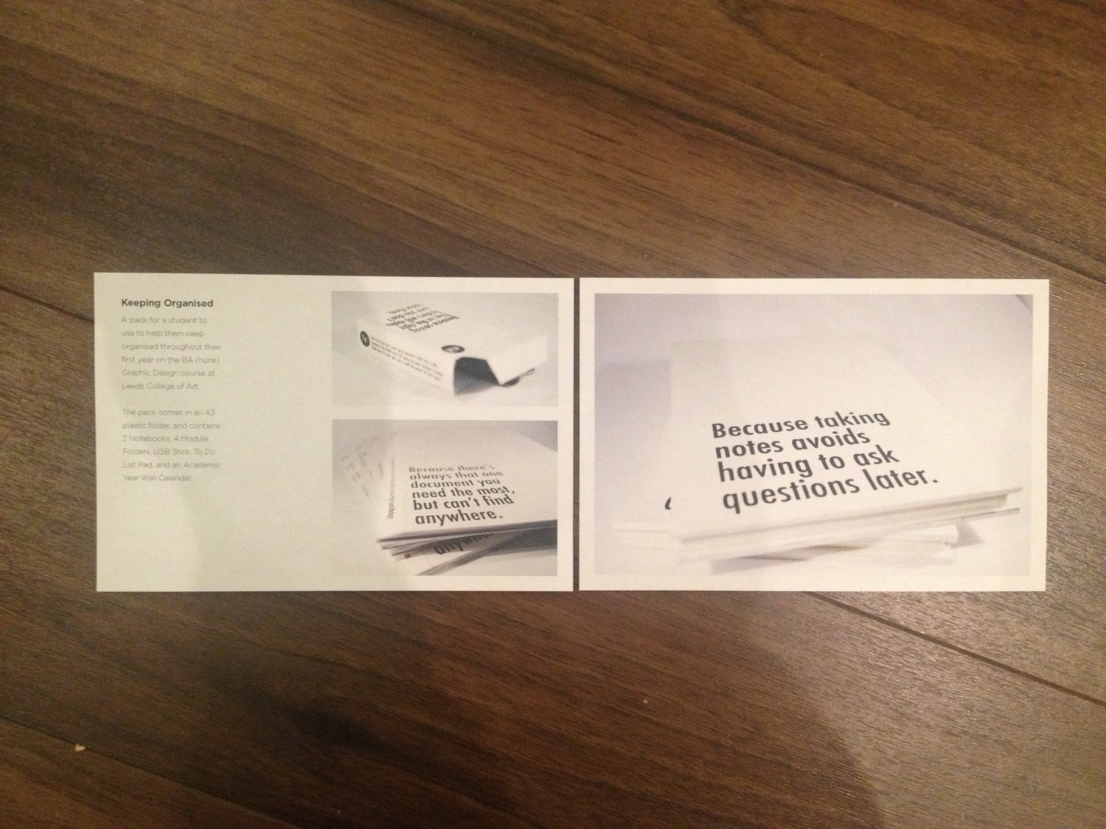
Now that I have got the type sorted out for what I want to use for this project, I decided to have a little play around with a few layouts for the book, to see how it works along side images and how it could possibly work as a whole. I used the measurements from the mock up book I made, which I ended up with pages 18cm by 12cm. I used my Keeping Organised project for this, and used the information from my website to work with. I used the layouts I drew earlier as guidance.
Looking at the mock up book, I had a go first at using just one leaf of the DPS.

I quickly moved on to using the whole DPS to work with. I like the idea of this one, but the thing is I don't feel like one image from this project really does it justice because of how much I actually did for it. I could consider rephotographing everything? Maybe.

So then I tried out a way to try and include more. I like the white space that adding the other images has added around them.

Considering the size of the book though, maybe I can't have that much if I want the images to be big enough. So I've moved the two on to the opposite page and made the bigger one fill the other page.

I decided to print these out to see how the layout works printed - it's the best way to tell whether it's actually working.
I quite like this, but I am still keen on the more white space idea. Hmm. I decided seen as these are to scale to add them into my book mock up that I made to try and get a better feel for them.

This does work quite nice, but I must admit I like it better on this image that I do when actually holding it. The inside of the book towards the spine disappears though. This is something that I need to work out better once I actually bind a book to see how much would actually disappear because this is still using the bulldog clips at the minute. I have put them right on the very edge though.

Looking at the copy on this scale page though and in context, I'm starting to have second thoughts about it. I think it sort of gives the impression that I have added the extra leading to try and fill more space. I think I need to try out descriptions for different projects on to scale paper and in context to decide whether this needs to be changed or not.

I am still keen on maybe having just one side of the DPS used though and the other blank. Not entirely sure why though, but I decided to experiment a bit more with it. Considering I want the images to be the main focus obviously to show off my work and my skills, this time I put them the opposite way around with the copy towards the spine and the image towards the outside. I did this in the screen shot above, and also tried it basically exactly the same but with larger margins around the image (which I didn't screen shot), so that it lines up with the top of the text. I printed both of these out.

I found that once I put the previous layout into the mock book I got a better feel for it, so I did the same with these ones.


I do really like having the focus on to just one side of the DPS rather than both, although I could maybe try having just the text on the lest side of the DPS like I have experimented with previously, that way it would create more space for the image to breath and still be the main focus of the DPS. It will also allow me to try out a bit more white space too.

The other problem with this though, of course, as I addressed previously, is the layout disappearing into the spine. It wasn't necessarily as crucial with the images as it is here with the copy. Without over bending the pages out and risking ruining the book, it is impossible to read it. I need to get this sorted/figured out, and fast!
No comments:
Post a Comment