
I got straight to experimenting with creating patterns using the letterforms. I started out using a sand serif typeface as I thought this would help to make the patterns look more modern and flow better.


After doing these ones I stopped with this because I think using a sans serif typeface, whilst making the designs look bold and modern and flow nice, there isn't really much of a variation to the designs and theres only a limited amount of ways to experiment with a letter, and then no matter what the typeface they will all just pretty much turn out to look the same.
Looking back over the brief on the website again, the section that stands out to me the most is the 'A few things to consider' part.

Where it says 'creates an air of sophistication and chic think Chanel', obviously I started thinking straight away about Chanel, and looking at the patterns I have already done I just don't really get that feel from them, so I decided to change direction with them a bit and use serif typefaces instead.


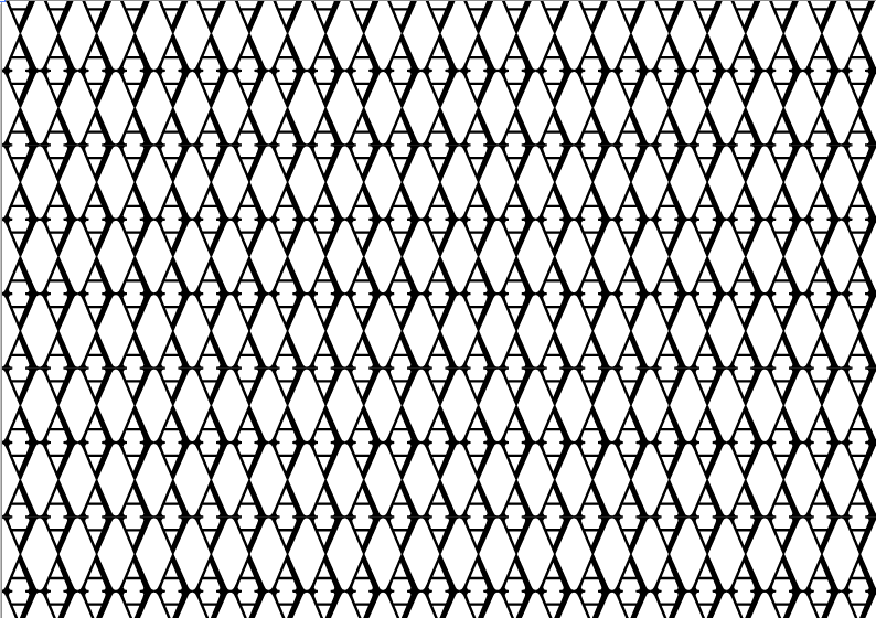


Straight away I started feeling these patterns more, and think they do tie in better with the 'think Chanel' approach. The serifs allow more of a structured form to the patterns, as well as giving me both straight lines and curves to work with, creating some really nice designs. I am much happier with these ones so I will continue with this brief down this route.
The artboard size that I am working to is A3, but I wanted to print out what I had so far to see how they look when printed, so I printed them out on to A4 to get a quick idea of this. Once I get into college I will print them out the proper size then too.

No comments:
Post a Comment