


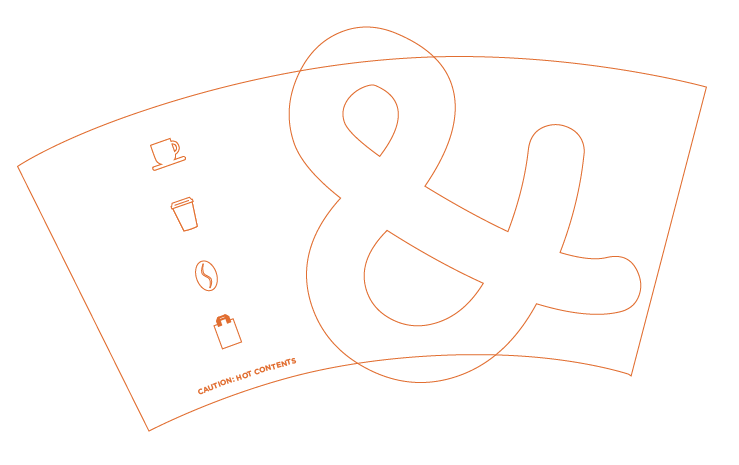
It works! I think it's a nice balance. I don't think it's quite finished just yet though and need to try experimenting a bit more with it. I like the idea of having a more abstract & on to it over the edges of the cup design. I experimented with it at different sizes and angles, as well as the positioning of the icons working along side it too. I used just the outlines again to give me a good enough idea without using too much ink.


I'm particularly happy with this last experiment. I just need to alter the position of the icons, and then I'll get it printed in the full colour to see how it works properly. I will also have a black lid on too to see if it still has the same balance with the colours.


It works really well. I just think that the & needs to be scaled down slightly, so I'll do that now to see how that looks.


Yeah, it definitely works better with that slightly smaller scale. I like that it's not immediately obvious as such, and the icons still work strongly as they are. I think the cups have come on a long way since the previous lot. I took some photos of the newer design alongside the older design to see which I think is working better.


Definitely think the newer design is a stronger one. There may be a couple more slight tweaks when I come back to them but definitely happy with where I am with them at the minute.
No comments:
Post a Comment