Wednesday 31 October 2012

Hot & Tasty - Take Away Cups Further Development

Looking back at the mock up cups I have, I've decided to have a quick experiment with making the icons black, and maybe including the logo on to the cup. I did this mainly on screen.


I definitely think the black icons work - it means that they can all be the same colour rather than before having them white and then the bottom one orange because it's in the white area of the & so looking as though it is meant to stand out or something when it isn't. It also adds that bit of black to the design that I haven't been sure about whether I needed. For the logo - meh... I can't really decide whether I think including it is a good move or not because in my opinion it's strong enough without. Hmm.

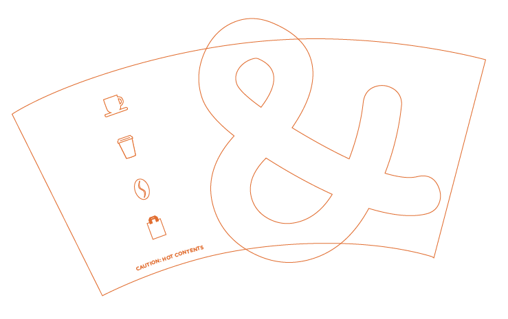
I've decided to print out and mock up the last design and mock it up to see if this helps me to make a decision about it.


Maybe not so much this exact one, I maybe need to see about the scale and what nott. I think I could really just take it or leave it. I'll come back to it and see, but I think this may be a decision that I need to be determined by the owner to see whether they think they need it to be on there or not.

I took some pictures of the two mock ups, with and without the logo side by side to help compare and see the difference that having the logo and not having it makes. Certainly think that having the icons black though was the right move to make.


Hot & Tasty - Take Away Cups Development

I managed to get hold of some black lids from work, so I put one on to the last cup I ended up with from my developments with the take away cups to see if it works, and if having a black lid on to the just orange and white design is enough, or whether I need to consider and experiment with adding black on to it.


It works! I think it's a nice balance. I don't think it's quite finished just yet though and need to try experimenting a bit more with it. I like the idea of having a more abstract & on to it over the edges of the cup design. I experimented with it at different sizes and angles, as well as the positioning of the icons working along side it too. I used just the outlines again to give me a good enough idea without using too much ink. 


I'm particularly happy with this last experiment. I just need to alter the position of the icons, and then I'll get it printed in the full colour to see how it works properly. I will also have a black lid on too to see if it still has the same balance with the colours.


It works really well. I just think that the & needs to be scaled down slightly, so I'll do that now to see how that looks.


Yeah, it definitely works better with that slightly smaller scale. I like that it's not immediately obvious as such, and the icons still work strongly as they are. I think the cups have come on a long way since the previous lot. I took some photos of the newer design alongside the older design to see which I think is working better.


Definitely think the newer design is a stronger one. There may be a couple more slight tweaks when I come back to them but definitely happy with where I am with them at the minute.