Showing posts with label 100.... Show all posts

Thursday, 10 February 2011

100... - Final Crit Response - Website/Blog

I think to tie all the book, mini books and poster together I will produce an actual website to accompany them. I will do it using the blogger website as I don't have enough time to produce a proper one, and don't really know how to get it actually on the internet, but I will make it as close to a website as I can within the limits of the blogger site.

The URL for this website/blog is 100coffeefacts.blogspot.com

Plan
I want the site to link in with the rest of the things I have produced, so obviously I will use basically the same information and images and what not. It will contain a selection of the facts from the book, but I won't include all because I still want the main focus of all this project to be that. I will use basically the same information on it as I have within the mini books, and also include a section which explains more about the book and gives previews.

Basic Layout
I have drawn out a few layout ideas as to how I could have the basic layout of the website, and then I will stick to them when producing each of the pages so that it will all visually link with each other.
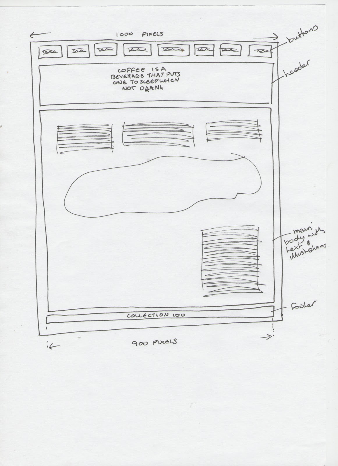


From the experiments I have made, the layout I will use will be:


Header
The header of my website will be the title of the book, which is the quote that I have used. I will use this and the coffee ring just the same as I have for the book. It will look like this:


Digitised version will be 900 pixels wide, which will be the width I use for the whole site, and it looks like this:

Footer
As well as having a header, each site has a footer where it basically explains who has designed it and what not, so I will basically have it the same as what I have on the back of my book and the mini books where it has my name and the project title. It will basically look like this:


Again, staying with the 900 pixels wide, the digitised version of the footer which will appear on each of the pages looks like:


Basic Set Up
To set up the blog so that I can get it to look as much like a website as I can, I went on to the design section and changed every setting, such as the background, text colour, etc to white. And the layout of it is so that at the top of just posts and then under it would be things like the archive and follow button, but I took these off because I don't necessarily need these on the site. So basically all that will be seen when clicking on the link will be a post, and then I will make buttons to navigate to different posts that will work as pages for the website.


Navigation Buttons
So because I have set up the blog so that there is nothing shown except the first post on the home page, I will design small navigation buttons which will appear on each of the pages so that the views can easily navigate through it to view each category and what not. They will just have the title of the category it is linking to, as well as a small version of one of the illustrations that is on the page to make them a little more visual, and obvious as to more what the category is of.

The basic layout of the buttons will look like this:


Here is each of the digitised buttons for each category.


They will appear on each of the pages n 2 rows of 4, and will be made to link to their own page. Here is how they look:


Home Page
This page will explain the purpose of the website, and what it is aiming to do, as well as containing a couple of the random general facts about coffee to start them off. I will have a small section at the top to explain the purpose, and then the coffee facts under this, and then below this will be a sentence explaining that to navigate through the website is to click on the buttons below it. I sketched out a few different ways of how I could have this look:


The digital version of this was again designed to be 900 pixels wide, and turned out to look like:


When the web page loads for this page, it comes up like this:


Category Pages
Each of the pages for the categories will hold the same information and same illustrations that the mini books do, that was it will keep it consistent all the way through. I will experiment on screen with the layout for how each will look.

Coffee Beans Page
After experimenting with the layout for the coffee beans page, I have decided it will look like this:


When the web page loads for this page, it comes up like this:


Coffee Countries Page
After experimenting with the layout for the coffee countries page, I have decided it will look like this:


When the web page loads for this page, it comes up like this:


Coffee Bean Process Page
After experimenting with the layout for the coffee bean process page, I have decided it will look like this:


When the web page loads for this page, it comes up like this:


Coffee Drinks Page
After experimenting with the layout for the coffee drinks page, I have decided it will look like this:


When the web page loads for this page, it comes up like this:


Other Uses Page
After experimenting with the layout for the other uses page, I have decided it will look like this:


When the web page loads for this page, it comes up like this:


Advantages/Disadvantages Page
After experimenting with the layout for the advantages/disadvantages page, I have decided it will look like this:


When the web page loads for this page, it comes up like this:


The Book Page
Once I printed and bound the book properly and took pictures of it for my final outcomes post, I put together this page. Originally I was going to set up links to be able to actually purchase the book but as time has ran away with itself, I have explained that in order to buy the book temporarily to simply email me. Maybe in the future after the deadline has passed I may add this link as I think it would be interesting to see if it actually worked. Here is how the page looks:


Here is how it looks when the page loads:


The URL for this website/blog is 100coffeefacts.blogspot.com

Monday, 7 February 2011

100... - Final Crit Response - Poster

As well as the mini books I am producing, I also like the idea of designing a poster to accompany both them and the book. I have given it a lot of though as to how I could have the poster, like what information to put on and what not, and the category I think would work the best would be the Coffee Countries one. This is because there is a lot of information around this category to work with, and I think it would be that bit more visually engaging.

So because I have drawn and scanned in the illustrations I have used within the books, to blow the world map illustration up to both an A2 and A3 size would probably pixelate it, so I will therefore trace over the Illustration using the pen tool in illustrator, which will then allow me to make it into any size as it will be a vector image, so would have the possibility to increase it to A1 if I want to.

Here is the world map illustration I produced in a good couple of hours using the pen tool in Illustrator.


I will add on the dots within the countries that produce coffees once I start designing the poster if I feel it is appropriate to do so, as well as the bean belt area within the 2 lines as I have used in the books.

Purpose
I will create the purpose of this poster to be so that it shows where in the world coffee beans actually come from, so I will include the bean belt and dotted area like I have in the book. Also, using what I did for the mini poster in the Coffee Countries Mini Book I produced I will use the key I did on that showing which countries produce just arabica coffee beans, just robusta coffee beans and which produces both. I will use the same key as I did and include the key section in the bottom right corner of the poster. I will name the whole poster Coffee Countries, so that it links back to the section in the book and the mini book. I will also include a little more information about something to do with the coffee sountries, and again use the coffee marks to 'colour it in'.

Design
Before I started to digitally edit the design of the poster, I printed it out to an A1 scale (using 8 A4 sizes as I don't have an A1 printer at home) and put it on the wall to get a general idea of how it would look. I then used a marker pen and marked on the basic elements of the poster and where I would roughly want them to go. I did this once I had added the dots and symbols to the map.


I first started the design by adding the dotted sections to the areas that needed them. Followed by the lines to section off the 'bean belt' area. Then I put on the key and positioned each of the symbols in the right places, and then put on the extra writing. Then once this was done I 'coloured in' the map using the coffee marks I have.


Information
The information that I will use within the poster will be from the coffee countries section in the book. But rather than just sticking it all on there I will just use what is relevant basically to what is being shown. As well as this will be the title I have used for the book, (and the link to the Blogger website which I decided to do after I made this so I added this to it then.), and my name will go on there too and the title of the project 'Collection 100'.

I first experimented with where the title could go within the poster.


Then I added the relevant information and the poster is finished.


The poster would be 'available' in both A2 and A3 sizes. I would have preferred to have got it printed out A2, but the digital print room was fully booked for the times I had free time to get it done, so because of this I have printed it A3. Even so, I think it still looks effective and works really well.


100... - Final Crit Response - Mini Books

Here is how I feel I can move on with this 100... project following the feedback I received from the final crit we had on 04/02/2011. Link to feedback.

As the book is pretty much finished, just the last check through and what not to get done and Jo and Amber didn't find fault with it, I were advised to experiment with how I could expand the information within the book. One key thing I remember them saying was that to read a book is a lot of information presented in front of you all at once and to maybe try experiment with getting across maybe some bite size chunks of the information as well as the book.

I looked back over the initial ideas I got for this brief, and with the Visual Language book fair fresh in my mind I pretty much immediately thought of giving it a go at making some mini books using the 'hot dog' fold technique which will have just a section of the facts from the book. For example, one could maybe be on the countries, another on the types of drinks, etc.

Size
I want the mini books to stay at a small size, because I want them to be bite size information, so once it is folded it won't allow me to put too much into one thing. I think this will also help to keep it to a minimum to hopefully make the reader want to read more from somewhere, and ultimately want a book as this is the main product I am producing.

The size of each of the pages from folding a A4 piece of paper using the technique makes them into A7 size (105mm x 74mm). This is a good pocket size and would be easy to just pick up and hold on to so this will be the size that I will produce the mini books to. If I were to make them from A3 paper, each of the pages in the mini book from that would be A6 sizes (148mm x 105mm), and I don't think working to this scale for what I am wanting to achieve will have the same effect.

Categories
I have looked through my book, and counted how many categories I could use from it that I think would fit into one of these mini books without having too much or too little information. These include:
  • Coffee Countries
  • Coffee Beans
  • Coffee Drinks
  • Coffee Bean Process
  • Other Uses
  • Advantages/Disadvantages
  • Coffee Machines (maybe)
There will be at least 6 of these mini books that I can potentially produce, and I want them to work as a set so that say if someone has seen one of the mini books, and a week later see a different one they would recognise it more due to the one they have already seen. Therefore, I will make the front and back covers for each of the mini books the same as each others, but have small elements of them different such as the category titles and images relating to them, so that each one still stays unique, but also works as part of the set.

Front Cover
I want to keep the front covers of them simple, so I will keep the content of it down to simply having the books title, category of facts that the book is on title, and an image relating to the category. I have drawn out some simple layouts experimenting with the composition of this.


The design of the front cover will be like this, but will obviously have the right category name and an illustration in the gap that is relevant to what the book is about.


Back Cover
I want to use basically the same rule as I have for the front cover for the back cover, keeping it simple. Therefore I will have the Collection 100 and my name section on it, like I do on the back of the actual book. As well as a short paragraph explaining there is more of these interesting facts available to read, and maybe direct them to a website where they can access this information. I put together some layout experiments for how I could have the back cover.


The design of the back cover will be like this on each of the mini books.


Coffee Countries
Now that I have the layout of how I want to have the front and back covers to the mini books I mapped out the general layout of what the book is when it is not folded together to see what page goes where to ensure it will fold int the right order and make sense. I then basically took the information from the book that I have (for this one for example) the Coffee Countries category and interpreted it into the book, playing around with the layout of it until I felt satisfied it worked effectively. Here is how it ended up:


When it is printed and has been folded it looks like this:


Coffee Beans
Using the same process as I did for the coffee countries, I experimented with the layout on the mac for this mini book as well, and will do the same for each of the other individual mini books too.

Here is the layout I ended up with for this mini book:


Once it'd been printed and folded it looks like this:


Coffee Drinks
The layout for this mini book ended up like this after experimenting:


When printed and folded it looks like this:


Coffee Bean Process
The layout of the mini book for the coffee bean process looks like this:


When printed it looks like this:


Other Coffee Uses
The layout looks like this:


AFter it was printed and folded it looks like this:


Coffee Advantages/Disadvantages
Layout:


When printed and folded:


Experiments
Whilst I was experimenting with the layouts for these mini books every so often I would print them to see how they were looking and if they were working. Here is some of the experimented books I made to see:


As well as these there were a variety of others, and I have just took a picture of these ones all together rather than taking photos of every single page because I don't think seeing every slight change would be too interesting.


Posters
When I started these designs, my intentions was that each mini book would have it's own unique poster on the reverse side of them when folded out relevant to what the book was about, and then they would be collectable as a set (for anyone like me who would stick them to their walls). I did start doing this, and produced a few of them, but time has ran away with itself, which I am genuinely gutted about because in order to get everything finished for the module on time I am having to sacrifice this. It would definitely be something I would do if given the chance to improve on the project, or if for some miraculous reason I got an additional day. 

So because of this I have put together a general poster that will go on the back of each of them containing the quote that I have used on the front of the book and what not. On these it will be done landscape, so I have also included a few extra coffee splats and what not to make them that bit more interesting. 

Here is how the poster looks:


Belly Band
To hold all of the mini books together if the person receiving them was to get them as a complete set, I have decided to design a belly band for them, similar to the one around my book but going completely round to hold them together. I will print it on the same brown paper so that they link together more as a whole project.

I basically just want it to have the quote on it, as it doesn't need any explanation because they pretty much explain themselves. Here is how it will look:


When I came to printing the belly band, my printed decided to not work properly and kept jamming the brown paper, so as a result of this I have printed it on white. It still does the job it is intended to do and looks probably just as good.


See photos of the final mini books here.