
I included the same information as the examples, and played around with the colour schemes and sizes and what not.


I printed a selection out at this point to make sure I am heading in the right direction with them

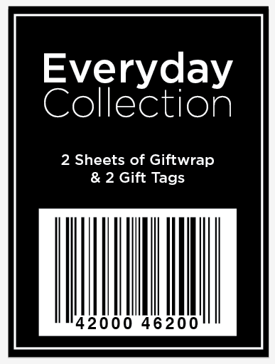
I think I didn't realise quite how small the labels are and didn't realise how small I went with the type at the bottom of the label. Mistake caught. Will make these changes. Not sure whether I prefer white or black background though. Might stick with white?


I printed a selection out again.

I prefer the ones without the extra line on the inside of the label - frees up more space. And just a couple of slight alterations to make. I like both the white and black background ones that are the same but reversed.


I am happy with these. As I just said the black would stand out better against the white on the wrapping paper so best stick with this. Tried quickly experimenting with the bounding box for the bar code but prefer the one I have already so will stick with that.


Quick variations of the labels that could be used on the other products that I have produced.

I think by adding labels on to the work it will just finish them off nicely and make them seem more real.
No comments:
Post a Comment