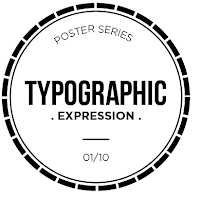
Tried the X thing but definitely don't want to go with this.
Hmm. I quite like where I am heading with these.
Tried without the circles, works just as well. Think I prefer the circles though.
Definitely a full circles rather than a dashed one.
Tried more squarer shapes but don't agree with these as much as the circle, just don't think they work as well.
Considering the fact that I am pretty set on a circle, and the posters are about coffee... ding din. Coffee ring? Made one and live traced it on illustrator. I really like how it turned out, first time I have tried something like this.
Definitely liking the coffee circle better than the first ones that I did, and it ties in more with the theme result.
Tried again without the circle this time with the less information. I like these, but prefer the fact that the circle links with the content more.
Minor variations.
I have decided on the logo that I am happy with. Been working on this a while though now so need to double check after I have stepped away from it for a little while.


No comments:
Post a Comment