
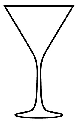
I worked on getting the glass right before I start on the colours for the drinks. I want this to be as simple as I can get because I want the focus to be on the drink & colours.


Need to see how this works now with colour in it. Also I want to include the garnishes for the drinks on the illustrations as well.


The black is a bit heavy against the colour really and doesn't really allow it to stand out, so I gave it a go with just outlines for the glass. That works better. Also, the garnish works better without an outline on it so I'll continue with this for the rest of the garnish illustrations that I do. Also, experimented with a gradient for the colour. Said in a different project how I am crap with these, but after playing around with it it's turned out alright. A bit of practice and I should get better at it.

Considering that the black is too heavy, I have tried having just the colour section from the illustration without the glass part. This works, but I do like the glass illustration. Hmm.


Decided to try having the glass as a tint of black rather than black, and this works a hell of a lot better. Tried having the black outline as well but nah. I think the grey represents glass better too.


I want it to look a bit more like a glass, if that makes sense. So I had a go and experimented with adding highlights to the coloured area to look like a glass. I like this definitely, it adds that bit extra to the illustration that was missing.

Tried again without the glass part and just the colour this time with the highlights too. I do like this, but prefer the glass on it too.

I want to have the glass part wider, so changed it and it makes the illustration work better. Definitely like these.
So using the same approach, I started designing more drinks.

For this drink, the garnish is a lime.


I tried the black for the glass again, see how it works against this colours.


Nope. The grey definitely works better.

Moving on.

The garnish for this drink is a cherry. I experimented with how to have this on the drink, and in it. Chanced the opacity to make it look like the cherry is actually inside the liquid.


Going to have a see how these work alongside each other.

These are coming along nicely. Definitely prefer this approach for the cocktails.
No comments:
Post a Comment