Monday 28 February 2011

Design Is About Doing - 'Opposite'

The work produced for this brief is to focus on the word 'opposite'.

Define: Opposite. (link)

-adjective
  • situated, places, or lying face to face with something else or each other, or in corresponding positions with relation to an intervening line, space, or thing: opposite ends of a room.
  • contrary or radically different in some respect common to both, as in nature, qualities,  direction, result, or significance; opposed: opposite sides in a controversy; opposite directions.
  • being the other of two related or corresponding things: friendly with many members of the opposite sex.
  • Botany. 1) situated on diametrically opposed sides of an axis, asleaves when there are two on one node. 2) having one organ vertically above another; superimposed.
  • Adverse or inimical.
-noun
  • a person or thing that is opposite or contrary.
  • an antonym.
  • Archaic. an opponent; antagonist.
-preposition
  • Across from; facing: The guest of honour sat opposite me at the banquet.
  • In a role parallel or complementary to: He has played opposite many leading ladies.
-adverb
  • On opposite sides.
  • On the opposite side: I was at one end and she sat opposite.
  • to the opposite side; in the opposite direction:  went to the left balcony, and we went opposite.

Different things relating to the word opposite.

  • saying one thing meaning another.
  • opposite colours.
  • one word in one colour then same in opposite.
  • complete opposite words.
  • opposite music.
  • too tall, too short.
  • long, short.
  • big, small.
  • opposite tastes - food
  • men/women - obvious opposite
  • opposites attract
  • tea/coffee are opposite
  • type of person - party animal/social pariah
  • brands
  • colours - complimentry
  • meanings - quotes changed to mean the opposite thing
  • pen/pencil
  • typefaces - serif/san serif
  • preferences
  • one saying looking like it means the opposite
  • opposite typefaces
  • hidden phrases in paragraphs changing the meaning to be opposite
  • hot/cold
  • light/dark


Concept
The opposite that I am going to go with to answer this brief is 'opposite meanings'. 

I will take famous quotes that everyone knows and change one or 2 words within them to ultimately change them to mean the opposite to what's originally intended.

I will start by researching for a wide variety of different quotes that everyone will know, followed by changing them to meaning the opposite. Then once I am happy with this I will make a start on the thumbnails, followed by the actual designs.


Wednesday 16 February 2011

OUGD102 Module Self Evaluation

What skills have you developed through this module and how effectively do you think you have applied them?
This module made me realise the importance to the research that is done prior progressing through a brief. I realised this whilst we were doing the group brief, so I immediately applied these new skills into the Collection 100 brief, and found that it really helped me to progress a lot better than I may have done without it. Also, I learnt how interesting it is to just let a brief pan out into something rather than progressing through it focusing on something I would rather do: this resulted in me producing the outcomes I have and I am pleased with it.

What approached to/methods of research have you developed and how have they informed your design development process?
After realising in the group brief the actual lack of primary research we did, I wanted to ensure that I conducted much more within the Collection 100. So to do this I went out and saw things and experienced things rather than just staring at the internet all day until I found something good. I also did things such as interview a Barista as I felt is was relevant to what I was doing, and is a good piece of primary qualitative research. By my doing this it helped me to understand my subject a lot better and helped me focus on the more important/interesting things I have found.

What strengths can you identify in your work and how have/will you capitalise on these?
I think the amount of research I produced as a whole was pretty strong. I made sure I got a variety of things rather than just relying on the internet to find everything out. Also, the level of motivation that I put into the module, especially over the last few weeks was an amount I have never really put in as much before, and I surprised myself with the amount of work that I managed to produce, as well as the standard of it maintaining quite high.

What weaknesses can you identify in your work and how will you address these more fully?
My weakness was definitely the start of the Collection 100 brief as I was taking too long to make decisions and move on from initial research, which resulted in me not leaving myself as much time as I would have liked to spend on producing final ideas. I do feel that if I would have picked up the motivation earlier on I could have possibly produced some more interesting outcomes to accompany what I already have.

Identify five things that you will do differently next time and what do you expect to gain from doing these?
  • I will definitely keep the level of motivation I worked up to having throughout the whole of the next module, rather than just for the last few weeks.
  • I will make sure that I spend at least an hour every day blogging and keeping everything up to date and organised throughout the whole module as I feel this would save me a lot of time at the end.
  • Again, I will try harder at improving my group working skills as I still identify this as a personal problem.
  • I will maybe experiment more with different methods to produce different outcomes, such as hand drawn illustrations, type, etc, before choosing which one to use rather than deciding before hand and sticking to it.
  • I will build more on the new skills that I have learnt from the year so far, and try to expand these within the next module, and the rest of the time on the course.


How would you grade yourself on the following areas:
Attendance: 4
Punctuality: 4
Motivation: 4
Commitment: 3
Quantity of work produced: 4
Quality of work produced: 4
Contribution to the group: 2

Final Postcard Designs

Here is my final 10 designs for the A6 postcards:


The back of each design will look like this:


See photos of the final postcards here.

More Photoshop Experiments

I experimented more with Photoshop for the postcards we are to produce. The brief asks that we use the photos that we took in the lighting studio session, but as well as this Amber said if we need to re take photo's for any reason then we can. And well, I need to because mine didn't turn out too well. But just as I was going to re take them I remembered that for part of my Collection 100 brief I used lighting equipment to take photos of cups of tea, as well as the tea bags. So, I have decided to use the tea bag pictures for the photos that I will experiment with for this brief because they haven't been used for anything else.

Experiments


I think quite a few of these looks really interesting and would work well as a post card, but I really think that keeping them simple will help them look more effective, so because of this I will produce 10 different versions of this last experiment to use as my final postcards.

Back
I want the back to look like a typical postcard does, so I had a quick look on google for some inspirationa and put one together that will be used on them all. Here is the design process of this.


The last one is what will be used on the back of the postcards.


Thursday 10 February 2011

100... - Final Crit Response - Website/Blog

I think to tie all the book, mini books and poster together I will produce an actual website to accompany them. I will do it using the blogger website as I don't have enough time to produce a proper one, and don't really know how to get it actually on the internet, but I will make it as close to a website as I can within the limits of the blogger site.

The URL for this website/blog is 100coffeefacts.blogspot.com

Plan
I want the site to link in with the rest of the things I have produced, so obviously I will use basically the same information and images and what not. It will contain a selection of the facts from the book, but I won't include all because I still want the main focus of all this project to be that. I will use basically the same information on it as I have within the mini books, and also include a section which explains more about the book and gives previews.

Basic Layout
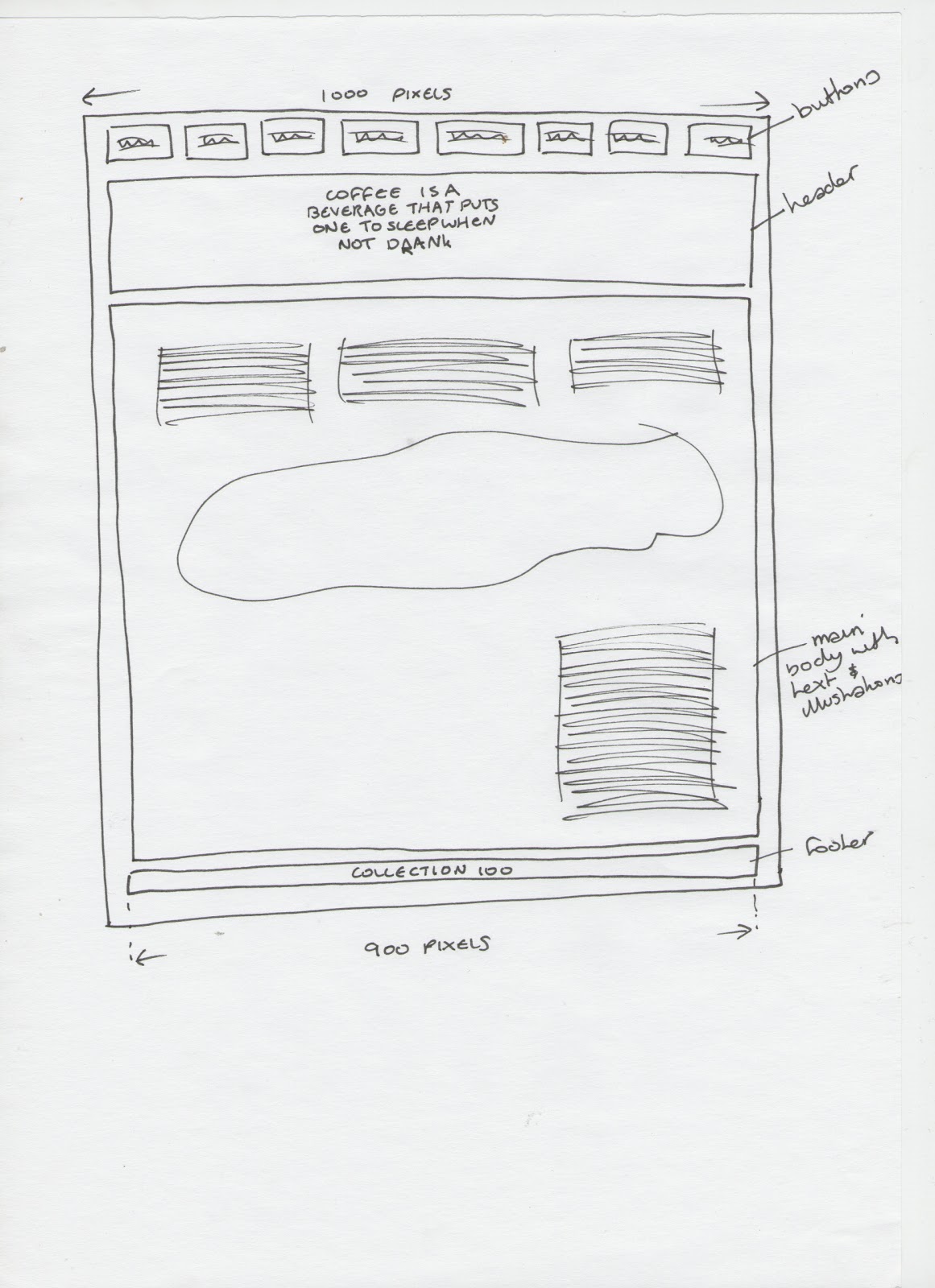
I have drawn out a few layout ideas as to how I could have the basic layout of the website, and then I will stick to them when producing each of the pages so that it will all visually link with each other.


From the experiments I have made, the layout I will use will be:


Header
The header of my website will be the title of the book, which is the quote that I have used. I will use this and the coffee ring just the same as I have for the book. It will look like this:


Digitised version will be 900 pixels wide, which will be the width I use for the whole site, and it looks like this:

Footer
As well as having a header, each site has a footer where it basically explains who has designed it and what not, so I will basically have it the same as what I have on the back of my book and the mini books where it has my name and the project title. It will basically look like this:


Again, staying with the 900 pixels wide, the digitised version of the footer which will appear on each of the pages looks like:


Basic Set Up
To set up the blog so that I can get it to look as much like a website as I can, I went on to the design section and changed every setting, such as the background, text colour, etc to white. And the layout of it is so that at the top of just posts and then under it would be things like the archive and follow button, but I took these off because I don't necessarily need these on the site. So basically all that will be seen when clicking on the link will be a post, and then I will make buttons to navigate to different posts that will work as pages for the website.


Navigation Buttons
So because I have set up the blog so that there is nothing shown except the first post on the home page, I will design small navigation buttons which will appear on each of the pages so that the views can easily navigate through it to view each category and what not. They will just have the title of the category it is linking to, as well as a small version of one of the illustrations that is on the page to make them a little more visual, and obvious as to more what the category is of.

The basic layout of the buttons will look like this:


Here is each of the digitised buttons for each category.


They will appear on each of the pages n 2 rows of 4, and will be made to link to their own page. Here is how they look:


Home Page
This page will explain the purpose of the website, and what it is aiming to do, as well as containing a couple of the random general facts about coffee to start them off. I will have a small section at the top to explain the purpose, and then the coffee facts under this, and then below this will be a sentence explaining that to navigate through the website is to click on the buttons below it. I sketched out a few different ways of how I could have this look:


The digital version of this was again designed to be 900 pixels wide, and turned out to look like:


When the web page loads for this page, it comes up like this:


Category Pages
Each of the pages for the categories will hold the same information and same illustrations that the mini books do, that was it will keep it consistent all the way through. I will experiment on screen with the layout for how each will look.

Coffee Beans Page
After experimenting with the layout for the coffee beans page, I have decided it will look like this:


When the web page loads for this page, it comes up like this:


Coffee Countries Page
After experimenting with the layout for the coffee countries page, I have decided it will look like this:


When the web page loads for this page, it comes up like this:


Coffee Bean Process Page
After experimenting with the layout for the coffee bean process page, I have decided it will look like this:


When the web page loads for this page, it comes up like this:


Coffee Drinks Page
After experimenting with the layout for the coffee drinks page, I have decided it will look like this:


When the web page loads for this page, it comes up like this:


Other Uses Page
After experimenting with the layout for the other uses page, I have decided it will look like this:


When the web page loads for this page, it comes up like this:


Advantages/Disadvantages Page
After experimenting with the layout for the advantages/disadvantages page, I have decided it will look like this:


When the web page loads for this page, it comes up like this:


The Book Page
Once I printed and bound the book properly and took pictures of it for my final outcomes post, I put together this page. Originally I was going to set up links to be able to actually purchase the book but as time has ran away with itself, I have explained that in order to buy the book temporarily to simply email me. Maybe in the future after the deadline has passed I may add this link as I think it would be interesting to see if it actually worked. Here is how the page looks:


Here is how it looks when the page loads:


The URL for this website/blog is 100coffeefacts.blogspot.com