Book Size
Before I started I needed to determine the size of the book I will produce. I want to keep it basically as an A size, so I had a look at small piles of paper for sizes such as A4, A5, A6 and A7 to see which I felt the most suitable would be in terms of how much information will be going into it, and still have the illustrations decent sizes and what not. I have decided after considering these that I will do the book A5 portrait size. I think it is a decent size without being too big, and allows me quite a large surface area to work with for each DPS.
Layouts
Final Layouts
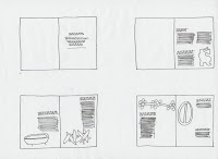
From the experiments I have made, here is basically how I want the layout of my final book to be:
Type Tests
The typeface that I select to use for the book is vital for giving the book the same light read feeling I am planning to achieve. I definitely thing I need to use a sans serif font to make it seem a bit more modern for the main text, and also when ever I think facts I for some reason think of a more squarer typeface so I will look into this. Also for the titles and what not I will use a different typeface that is not too different from the body copy one, but is bolder and clear.
<type tests>
Out of the typefaces I have looked at the ones I think will work the best for each's purpose as well as working well together is the Copperplate and Eurostile fonts. So I quickly printed a test sheet experimenting with different font sizes and also different leadings to see what looks the best when printed and will work well throughout the whole book.
I think the best setting for the body copy is to use it at 10pt with an 11pt leading setting.
Digitising
Whilst I was digitising each of the layouts and experimenting with them, I printed some out every so often to check that it looked ok on paper as well as on screen. Some have more of a change than others, but here are all the printed versions I made of the page developments:


No comments:
Post a Comment