How is it time for this already?!
s-pritchard1013fmp.blogspot.com

Sunday, 16 December 2012
Wednesday, 12 December 2012
End of Module Evaulation
Overall, I am pleased with the progress
that I have made throughout this module. I have learnt a lot about myself as a
designer and how I work when I need to take things into my own hands.
In terms of everything that I have done overall,
I am very happy with my outcomes as I have managed to achieve a professional
standard to them that I have been striving to achieve. I have definitely found
that the attention to the smaller details within a brief is what can really
make a difference when it comes to making a brief look alright or look amazing.
My time management has been fairly good
during this module, as opposed to ones during the last two years. I have found
this to be highly beneficial for my design practice and has allowed me to excel
my expectations of what I initially believed that I could achieve. This is
certainly something that I am to continue during the Final Major Project
module, and to push more with too to get them tighter.
The thing that I have most enjoyed about
this module has to be the competition brief that I entered for the Tigerprint
Black & White Print brief. It has really opened my eyes to the possibility
of what can be achieved with something so simple to begin with, and has
certainly got me thinking more about the range of outcomes that are possible
within a brief.
My biggest downfall has to be when I come
to completing a brief, I would get so close to finishing and then instead of wrapping
it up and drawing a line under it I would just leave it until later, which I do
believe if I hadn’t had done that and just got it finished when it was actually
finished with the design boards done then I would have had more time towards
the end of the module to continue designing. This is something important that I
have learnt, and will definitely be keeping this in mind when I approach the
end of briefs throughout the FMP module.
I didn’t work on a collaboration during
this module, but I do have some planned for the next which is going to be
interesting. I do feel like I have come a long way when it comes to them, and I
think if I take forward what I have learnt from this module about myself into a
collaboration, then this will allow me to feel a lot more confident with myself
and my abilities that I can bring to the table.
I am definitely completing this module with
a smile on my face, and hope that this continues for the rest of my time on the
course.
Attendance: 3
Punctuality: 5
Quality of work: 4
Quantity of work: 4


Cocktails - Print Slot
I am pleased with the progress that I have made on this brief, but being realistic about everything, as well as the stock that I have ordered still not have arrived, I am not sure if I am going to get the book finished before my print slot. I'm gutted. I am going to use what I have so far to mock up and photograph it the best that I can to use on my design boards.
The images that I have taken and will use on my design boards are:


It has mocked up quite nice. It would have been nice to have it finished but ah well, I have done the best that I can.
The images that I have taken and will use on my design boards are:


It has mocked up quite nice. It would have been nice to have it finished but ah well, I have done the best that I can.
Cocktails - Revised Brief
Seen as I have reworked my other briefs, I figured I had best get this one done properly. Following the notes that I have made, I wrote it up.


Hot & Tasty - Revised Brief
I've gone back to check to see if any alterations are required for my Hot & Tasty brief. Only a couple of small ones are, which I am happy about. So my finished brief that I shall be used is...


B&W - Revised Brief
I have come back to have a quick look at the brief that I have for the Black & White brief. Considering what I have just done with the Typographic Expression brief where I have pt it into parts, I have realised that I can also do that with this brief. So I have edited the brief as required, and here is the new ones.


Type Exp - Revised Brief
I need to get the design boards finished because my print slot is way too quickly approaching. I have come to rework the ones that I have done, and then started thinking more about the brief in general. It has come on a lot since I started out with it - should I rework this? I feel like I should. I'm sure it will be ok.
I've started to note down what to put on my design boards, and realised that the brief can actually be split into 3 parts:


I've started to note down what to put on my design boards, and realised that the brief can actually be split into 3 parts:
- design the posters
- experiment with presenting them
- method of distribution
Hmm. It would be a proper packed brief to include all of this and explain them too. Could I split the brief up? Make an individual brief for each part? I wish I hadn't left it too late to do this so I could ask someone. Sod it, I'm doing it ha.
The brief title will remain the same, and will have part 1, part 2 and part 3 extended on to the title. I will keep my labels the same as it is essentially just one brief. I could maybe add extra labels for each part? I need to stop waffling on now and do this.
I've made notes and typed them up on to the brief templates.


Cocktails - Stock Consideration
The stock that I use to produce the book is important. This is what will make the difference for it being mint or not. As explained in a previous blog post, I have ordered a 120gsm silk stock for the pages of the book, which still hasn't arrived!! I want to also consider other aspects of the books stock too.
I think using asotate would be quite nice, by printing the cocktil illustration on to there rather than on to the facing page from the information, that way it would be seen on both? I bought some to give this a go and tried it with two different ones.

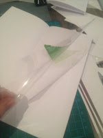


It seems to. Trying it in context.


I think using asotate would be quite nice, by printing the cocktil illustration on to there rather than on to the facing page from the information, that way it would be seen on both? I bought some to give this a go and tried it with two different ones.


This works quite nice, although the sheets that I bought weren't intended for inkjet printers. Could I get hold of some in time? I don't actually think I could. I could get some for lazer printers from the library and use that, but the colours will shift with the different printer being used. Hmm.
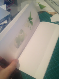
I have some trace, which could work? It's transparent like the other but not completely. It's worth a try. Again I did it with the two different ones.


Wow. I really like this, more than the other actually because I like the cloudyness to it. And I like how even though the illustration is just printed on to one side it shows up clearly as if it is printed on both. Very happy with this. I think this may be something to go with?
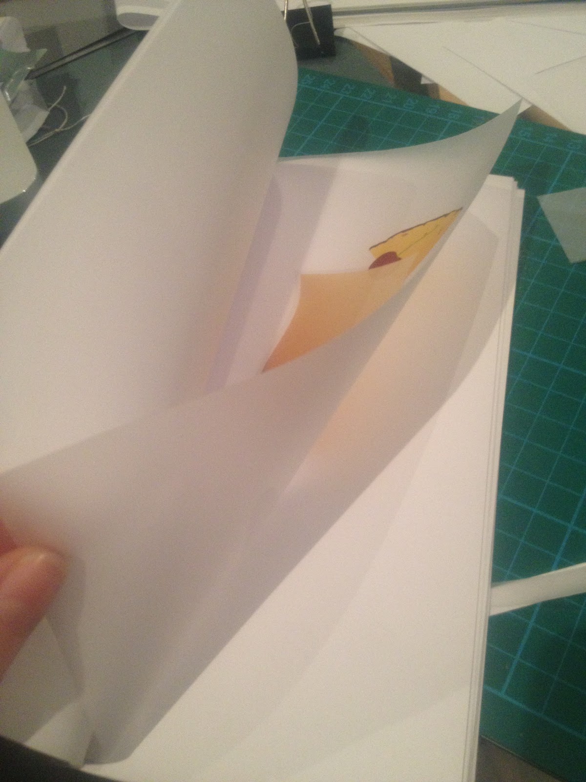
I've decided to try it with the trace laying on top of the DPS with the actual type section included, see how it works with that.


Definitely works. And I like that with the cloudyness to the trace you can still see the text underneath the trace, but it is sort of musked out so you know you're not meant to read it just yet until you turn the trace page. Really happy with this.
A similar idea that I have just had with this is to separate the glass part of the illustration and the colour part, and then have the colour part printed on to the left side of the DPS as originally intended with the whole illustration, but just this, and then print the glass part on to the trace like previous. That way then the glass part will be laid on top of the colour part. Would this work? Hmm. Had a quick try before trying it in context.


It seems to. Trying it in context.


This does work, but choosing between doing this and doing the previous I prefer the idea of the previous so am going to stick what that.
Decided to give it a go with a different illustration to see if it works the same as the other two consist of the greens.


It does. I really like this. It will up the page count of the book but I think it's definitely worth it.
Subscribe to:
Posts (Atom)