Here is how it now stands as I showed previously with the logo added to it and the information changed slightly.
I have ordered my stamp with the logo on, as explained in a previous blog post, so this will be highly influential with how I will choose to have it look in the end.
I printed it out to put together to see how it works. Keeping in mind the stamp, so I would replace where the logo is on both sides with a stamped version afterwards. My other thought for it instead of the stamp is to maybe have it foil blocked or spot varnished instead.
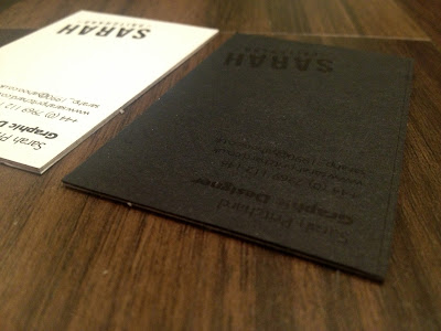
I have tried out a small number of variations for the business card.
- The first is that I have printed the black side on to a black stock, and printed my logo in black too onto it, which has actually come out very nicely! I can imagine the stamp would look the same as this. I do quite like the idea of it being spot varnished instead on this side though. I think that would look pretty sexy. Then for the white side I have printed this on to a white card stock, and then stuck them together so that it is duplexed.
- The next I did the same again, but this time I actually printed the black side on to a white stock, and then the white side on to the black stock, so that my information is on the black side instead. Again, I think a spot varnish would work nice for this as well, but may turn out that bit too difficult to read the information properly on it. Could look nice foil blocked though?
- The next one I printed both sides on to white stock. I duplexed this again, but this wouldn't really be necessary for this one as I could select a much heavier stock to get the same effect as this. Then the same again considering which print finish (if any) I could use.
- Then the fourth one, which at the minute is my favourite I think (can't quite choose), is I have done it just the same as the previous one, so could actually just be done on a heavier stock, and then this time I have coloured the edges of it black, which would mean I would select colour edging print finish. This was a bit tricky to do myself obviously, and isn't perfect but I don't think I did too bad a job actually. I tried to get a couple of images to show this. For this one if I chose it I could have the colour edging, then the stamp for the logo? Maybe.
When I had finished all four variations of the possibilities, I took some photos. I got quite carried away with this and took quite a few, basically to try and show off what I have considered and tried out. The different angles of them help me to do so.
I am going to get other peoples opinions on these to see what they say to help me make my final decision on what to go with before I do go forward and look into getting them printed. Can't wait though it's exciting, and I will certainly get other peoples honest opinions of them because I don't want to end up making a mistake.
Also, I actually did them before I experimented with the typeface for my book so I need to look at possibly changing it on these too (oops!). I'm sure it will work out fine though.


No comments:
Post a Comment