
Considering the sort of icons I could possibly use, I made some up using illustrator consisting of just lines. I did things like mugs, knife & fork, clocks for open and close, plates, etc.

I like the simplicity of them. To make them a bit more solid I tried them in circles.

Obviously I need to be working on these in the colour scheme so I added the orange to the background, then experimented with the line point size.


I tried this out reversed to see if it works the other way around, and again experimented with the point size of the lines.


It works better with the thinner lines with black on the orange background and the opposite way around with the orange on the black background. I'm not entirely sure/happy with them so far. I also tried changing the point size of the circle going around the icons. I think this works better with thicker ones.

I tried them both next to each other so that I can compare them.

I decided to experiment further with less of the icons. This is so that it's easier to make quick changes and can focus more on them rather than having it just all look busy with having so many different ones. I used the three I feel are most relevant. I carried on experimenting with the point sizes of each of the elements to try and find a happy medium between them.


Reflecting back over everything I had done so far, I got the idea to try colouring the icons in to be more of a solid colour rather than lines. I prefer these to just the lines as the icon as a whole just stands out more and works better as a whole.

I coloured in the handle on the cup as well, and then experimented with the thickness of the circles around the icons to see which works the best.


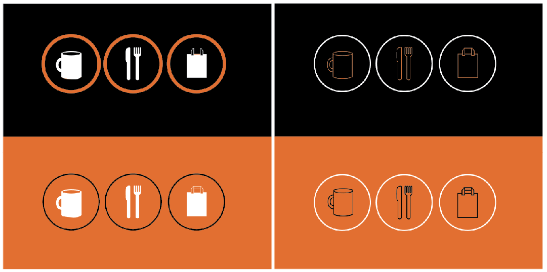
I like them more with a thicker circle around the icons. I had a quick try with the just lines icons and made the circles around them thicker to see if this works. It does. Dilemma time!

I put all the variations together to compare them. I need to get a printed version of these to see which works better in print, and then I guess this will come down to the cafe owners decision as to which they prefer (if they do like icon idea!).

AND, now that I have considered using the third colour, I've experimented with adding white to the designs. I'm keeping either the black or orange as the background so just added white to the icon elements. I tried them all in different ways to experiment with the possibilities and got them printed out, along with the ones with no white to see how they work once printed.


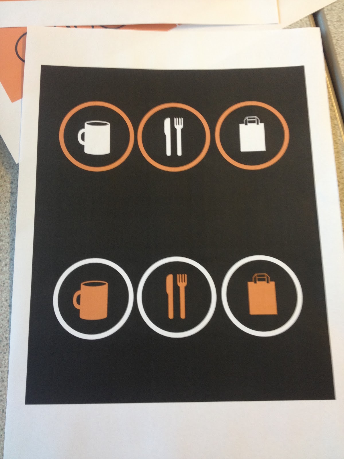
Here's them printed out. The photos were taken on my phone, so not the best quality I know, but it does the job.

I gathered people round off the table to have a quick look at them with me. It was decided straight away that they work better with the white elements.

I agree with this, they look more solid and work better as a whole with the white introduced. The one that everyone said stood out the most to them was the one on the left second from the bottom (I have a scribble at the side of it). I like this one too, but also the one on the top left which is also scribbled. I think the top one though would work better with a thicker white circle around more like the one near the bottom. I'll change this to see.

And it printed...
I think it works both ways round so I will get the opinion from the owner on it.
No comments:
Post a Comment