
After seeing how well the layout sits for the saving for print section I have just done, I decided to revisit the colour dps that I have done. I weren't really keen on how I had altered the image to working across both pages so I have decided to change it.
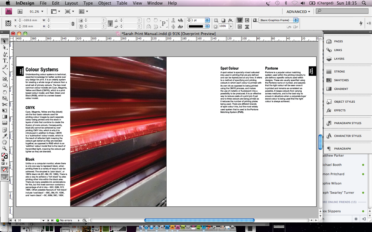
I changed the image back to how it was previous to when I edited it. I just think that it works a lot better like this.

I then experimented with how I could have the copy across the pages as it doesn't necessarily matter what order that they go in as such as they don't follow on from each other, just need to make sure I keep the 'intro' as the intro followed by the CMYK information being the next to be read.

I tried keeping the info on the left then having the rest of the copy on the right. I think this works but I am not too sure how there is two columns.

I moved the CMYK information back over to the left page trying it lining up with the bottom of the page with the bottom of the image and other copy but I don't like how this sits. I thought it may make it look more balanced but it just doesn't.

I moved the column of information over to the right of the right page. I think this works well, and like the white blank space that has formed. I will leave this for now again and come back to see how I perceive it after working on other layouts, but I am pretty happy with where it's at at this stage and definitely think it works better than what it did previous.
No comments:
Post a Comment