Monday, 23 May 2011

Speaking from Experience - Actual 'Pack'

I was considering how I would have the actual pack I would be putting all of the different products into to then give to the students. My initial idea was to have a box that opened up and has everything inside. Although time is running out and I think for me to get it to a standard that I would be happy with it would take up too much of my time and make less time for other things. So I began to figure other options, which included things along the line of a ready made box that I could stick something on to. After not coming up with a 'good enough' solution I decided to leave this thought for a while and come back to it, and at this point I were packing things away to go home from Uni and was thinking how I could use an A3 plastic folder to carry all the different stuff I had with me, and that was when I realised to have my actual 'pack' as one of these folders - it would be both useful and relevant to the student, and be an additional way for them to keep organised. So I went and bought one from the library which I will use for the final product.

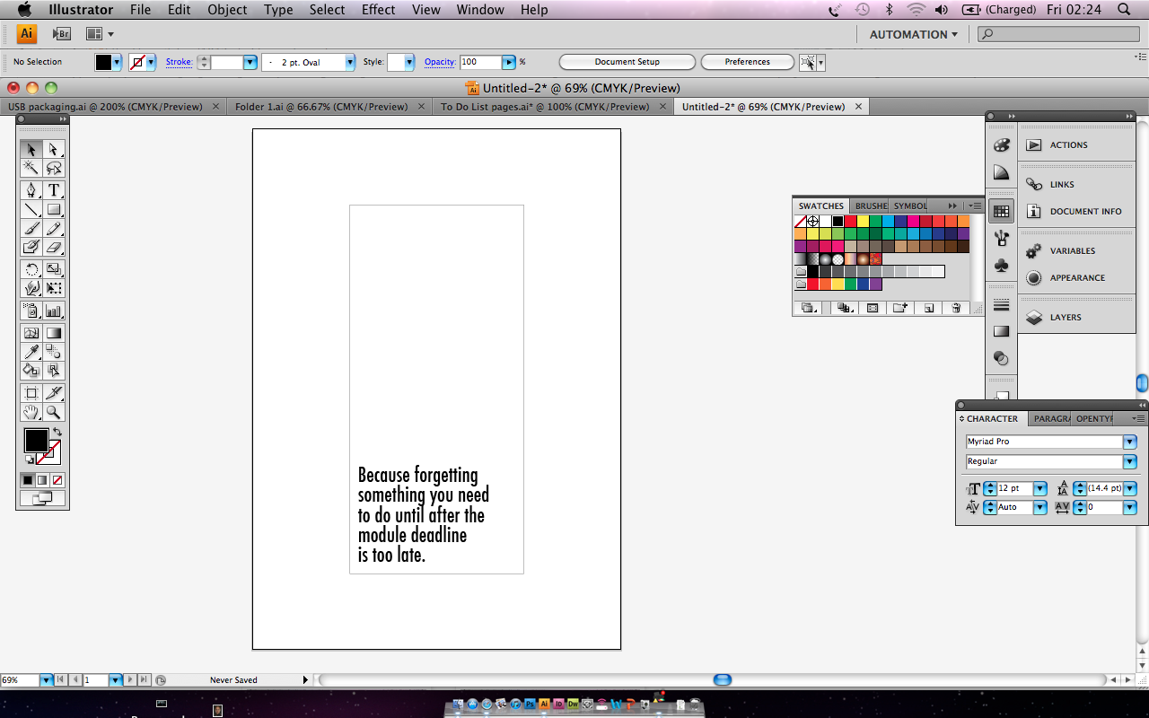
I will have something printed and stuck to the piece of card that comes in the folder to keep it visually consistent with the rest of the things I have done. I think because this is the thing that basically holds everything together that it should have the main sort of 'reason' for the pack.


The cardboard in the folder will have this on it.


Speaking from Experience - To Do List Pt 2

Keeping a To Do list is something that everyone does, and I asked a few people if they had any with them to look at to see how they did theirs.


 I just want to keep the ones that I do simple because I don't see the need to over complicate them. I sketched down a few ideas and then digitised one.


I am unsure what size to do the actual pages of the pad, so I decided that over the next week or so I would use them as I am intending for the student next year to, and see which size I think works the best after that. Also, I want to use a low gsm stock for the list to make it have sort of a discardable feel to it, so that the student would feel alright about throwing the list away once it is completed. As well as the fact that I will get more pages into the pad without it getting to be too thick. So as well, I printed lists to use on both the normal paper and layout paper that I have listed on the Paper Stocks post (here). Here is the different lists I made:


I think the better one of the two is the narrower version. This is because you don't need 'loads' of room to keep the list, and this way it will be easier to get more pages from less prints.


So using the template I used for the actual pages, I then put together what would be the front cover to the pad. Again the same as the notebooks it is obvious what it is and what it's for so it doesn't really need an explanation so I will keep it simple and just have the quote. I want the cover to be of a thicker stock than the layout paper so I have decided to print it on to the Ice White Canford Paper. I played around with how the quote will read and look before I printed it out.


See the finished product here.

Speaking from Experience - Notebook Pt 3

Now that I have the Folders and Wall Calendar designed, I moved back on to getting the Notebook done. I decided to put capital letters on the header section of the note pages as I think it looks that bit better.


Doing just the same as I did previously, I printed out the pages for the notebook and trimmed them out. I then started thinking about the covers for them. I don't think I need any explanation of what ever on the notebook because it is pretty obvious what it is and what it's for. I don't think I will have the time to screen print either, so I decided to print the covers before I backed the hard card this time. I worked it out so that when it is printed, the folded round edge will go to the outside to make it look neater. So here are the files that are printed out again on to the Linen paper as I used previously.


Each element used to put the notebook together.


See the finished product here.


Speaking from Experience - Folders Pt 4

I have decided that because the overall look of the calendar looks a bit different to the folders, I will interpret the circles and lines graphic elements within the folder designs to keep them visually consistent. Once I started to add these I realised how much better they look with them on, and made the previous designs look a bit naff. I also decided to include how many credits each of the modules are worth to the inside of the folders, as well as a little section to write the module deadlines on there too.
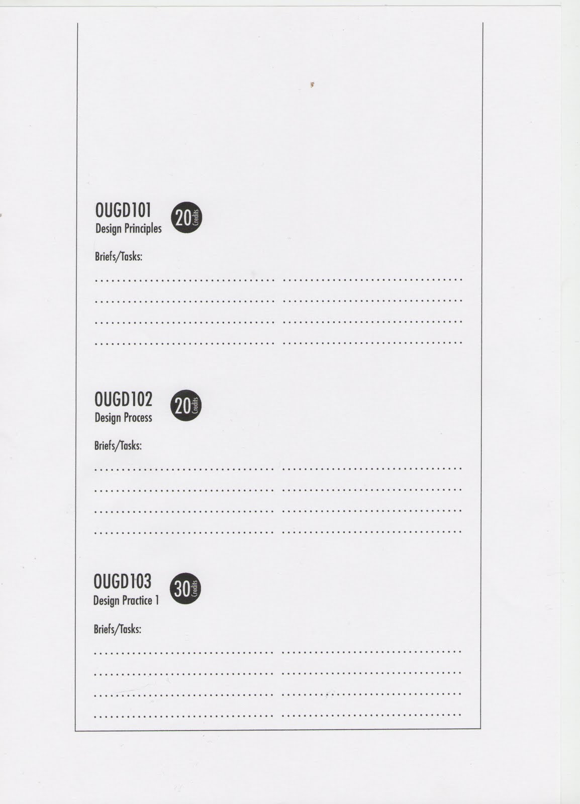


Also, I decided to change the word 'file' to the word 'document' in the quote as well as I think a sheet of paper with information on is more like a document, and a file is more like something you save on a Mac. I have a few other people confirm this also before making the decision to.


Here is how the folder designs now look.


See the finished product here.