Showing posts with label NO NEWS IS GOOD NEWS. Show all posts

Saturday, 20 November 2010

No News Is Good News - Crit Feedback/Further Development

So because I have used a different typeface on the mailshot, I have decided that I will use the same typeface on my posters. Here is the typeface being used on the type and image one. Also, even though you can't see it on this version because it is black and white, I have also changed the colours of the bottles to that the top is white and the actual bottle is in the orange/yellow colour. I also changed the line thickness so that it is more bold and shows up more.


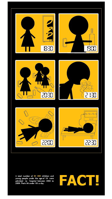
I then had a go at changing the just type poster to the same as it was but using the different typeface, but decided that I would change the layout for it, and found that this version works a lot better.


So I thought now I have this one, I would have a go at using this type and interpreting one of the bottle images onto the poster to use as my type and image poster because then this way it will make the type and image and the image poster look basically the same. This turned out to look a lot better. 


I have kept the image poster the same as it was, just changed the colours round on the bottles to that they matched the one on these ones.

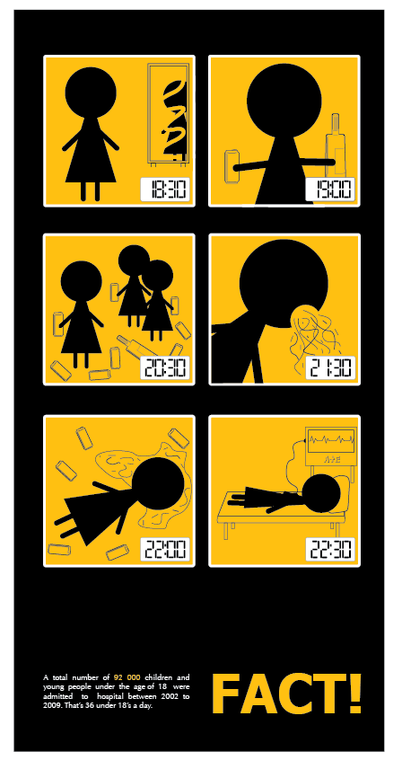
Here is how my final 3 posters now look.


    Monday, 8 November 2010

    No News Is Good News - Crit Feedback

    Here is my feedback I received from the crit we had on 5/11/10, where we put our designs into studio 4 and other students gave us feedback anonymously.


    Friday, 5 November 2010

    No News Is Good News - Final Idea Development

    The idea that the people I asked thought worked the best was the one with the bottle illustration because they said it gives a much stronger message than the other one does. Also, whilst we were discussing it, I was given a couple of suggestions as well as wanting to develop certain things further myself, so I will go on to develop this one.

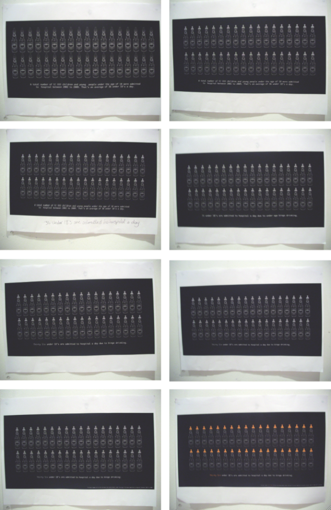
    Instead of having just 7 bottles in a line across the poster, because this doesn't really link in with the fact I am communicating, I decided to have a go at putting 36 on there. 36 because that is how many young children are taken to A&E a day. As well as this I also edited little things as I was developing it (as shown). The colours are black and white again because it is too expensive to print every time in colour in the mac suite, so the black and white gives me a good idea of whether the layout is working when printed and what not. Then when I was happy with the development I printed one in colour to make sure it was right.


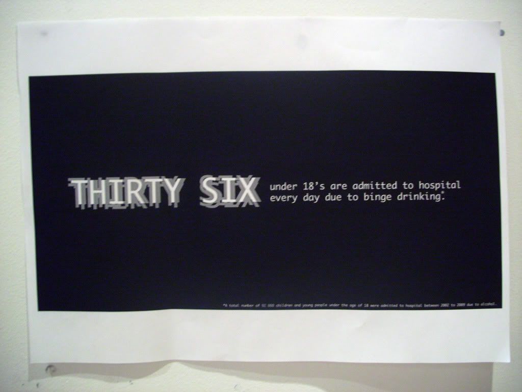
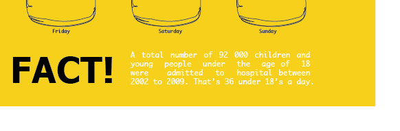
    Once this was done and I was happy with it, I went on to produce the text poster. I basically just got the text from this poster and made it bigger. I also tried a blurry effect on the words 'Thirty Six' to give a sense of blurred vision which can be caused by drinking. I also then used this on the type and image poster to keep them as a set.


    Then for the image poster I just took off the text from the image and type one to then use. Once I had done this, and got all 3 final posters ready for the progress crit, to give my project a more profession feel to it when looking at the posters, I went down to the Digital Print room and got each of the posters printed out down there because it is better quality, and done on Gloss paper. They look really good, although looking at them makes you not want to touch them for incase you get a finger print or a smudge on.


    Thursday, 4 November 2010

    No News Is Good News - Ideas Development

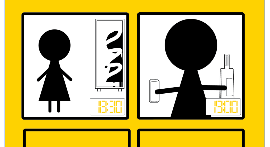
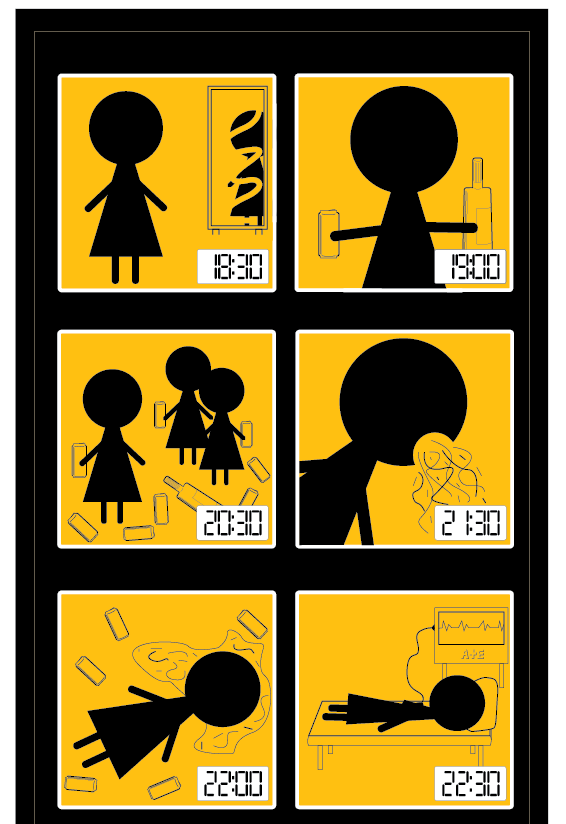
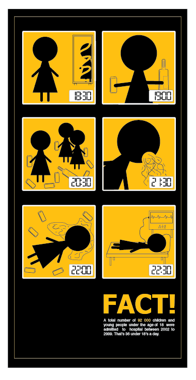
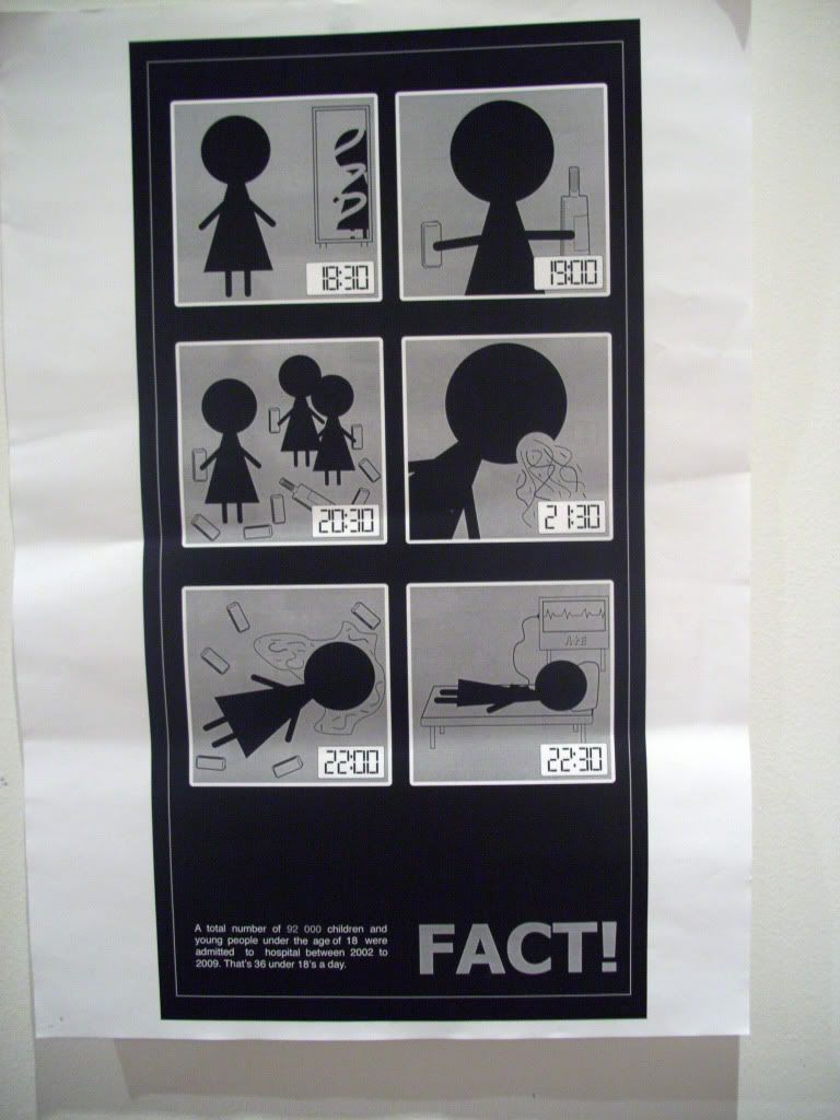
    The idea that stands out quite well from the ones I sketched in my opinion is the one with the storyboard of a teen going from getting ready to ending up in A&e, and showing the sequence between.

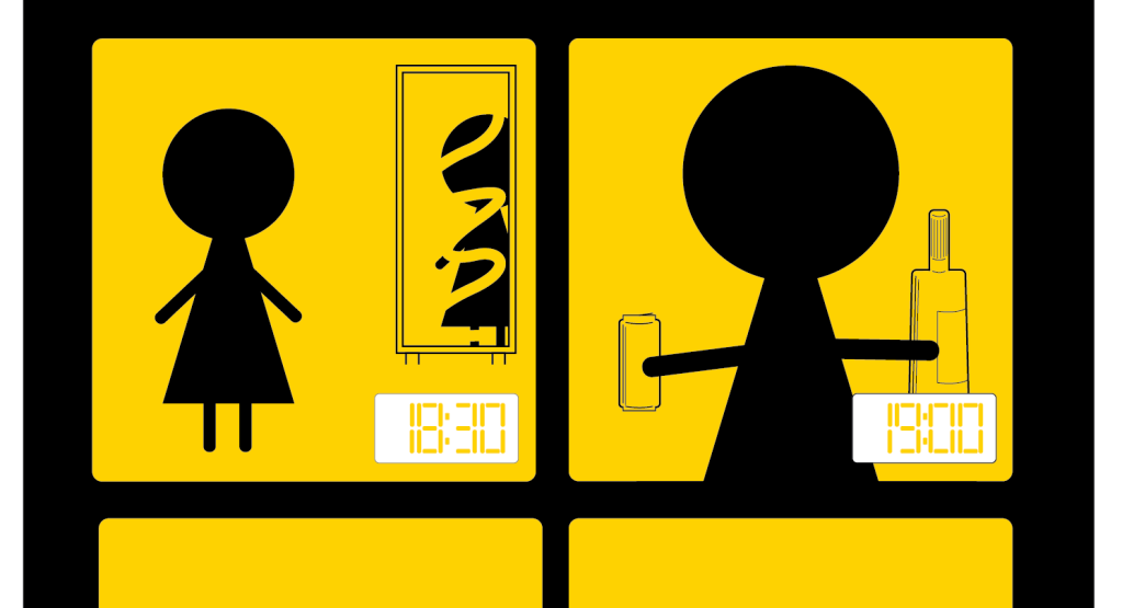
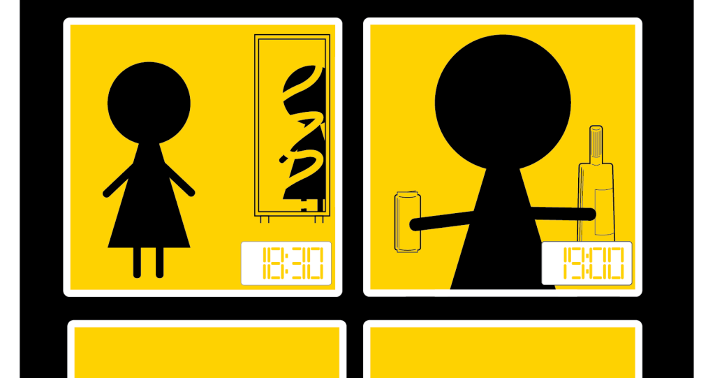
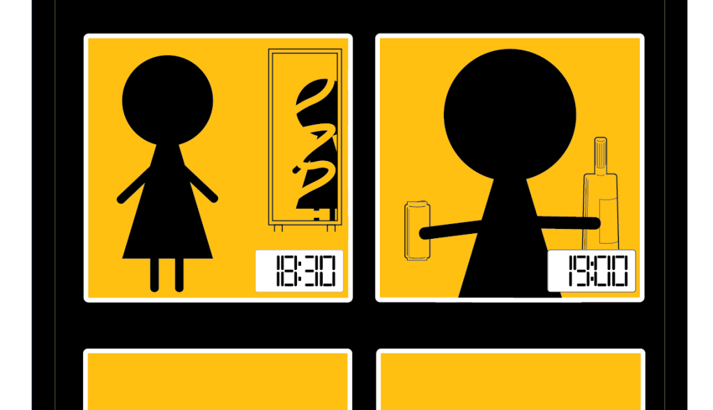
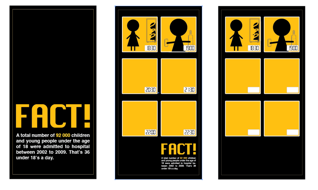
    I am using Illustrator to produce this, using the skills and techniques learnt from the Illustrator inductions we have had. Here is the development of this..
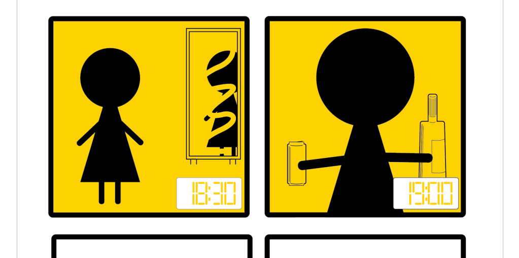
    I have decided to use black and yellow as my 2 colours and white as the stock colour. I have chose these because when I see them working together it gives me a sense of more of a warning feel rather than a stop feel, which is more what I am wanting to achieve.


    I have included the time as a digital clock in each of the bottom right corners in the sequence to give a good idea of what is happening at what time.


    I changed the yellow to a more orange/yellow colour because I think this works stronger with what I am wanting to achieve from looking at it.

    Before I went on to produce each of the squares, because they were turning out to be quite time consuming, I produced all 3 posters as a set to see if they were working so far, and if they were as visually appealing as I am anticipating. I think they are working quite well.


    Here is the finished poster for the type and image one from the set I am designing. I think it works quite well, and is immediate with the message of the poster.


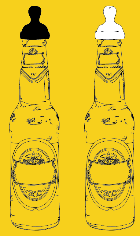
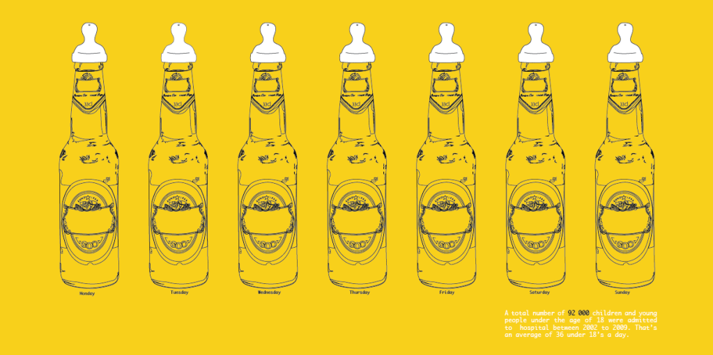
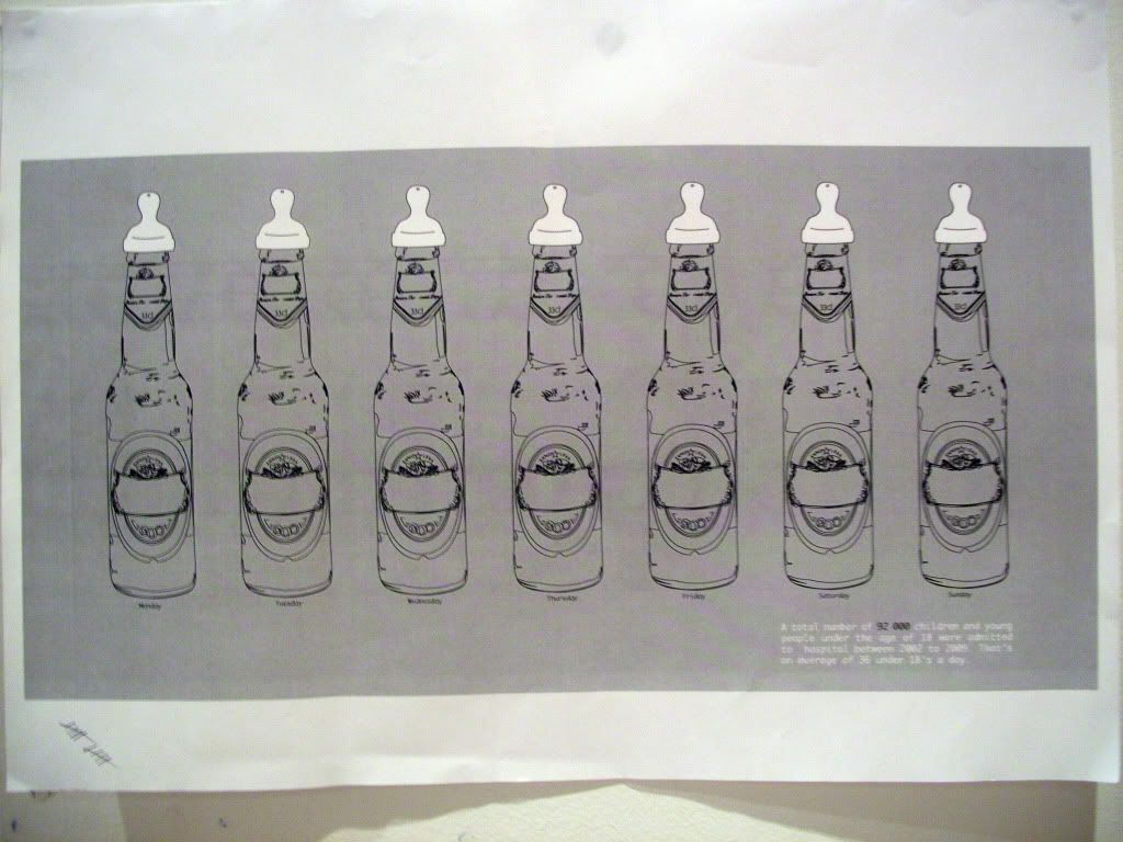
    I don't want the bottle illustration that I made to go to waste, so I spent a little while changing it so that it was in a simple black and white format. I also added the child's drinking top to it to see how effective it will look like this. I also gave it the orange/yellow background colour because these are the colours that I am definatly going to use for this brief.


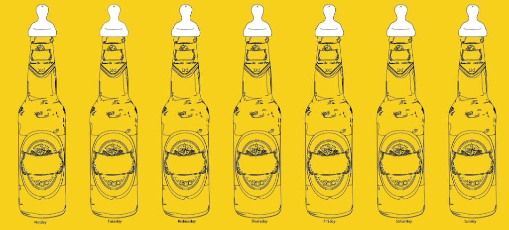
    I weren't sure whether to have the top a solid black or black outlines with a white fill colour, but looking at them both together I think the one with the white fill colour looks the strongest. So I put together a series of them in the way of a different idea I sketched.


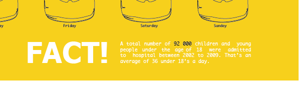
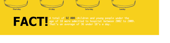
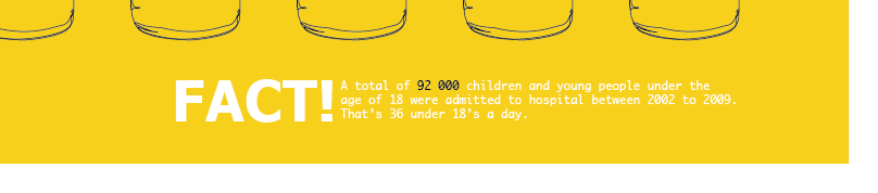
    I think this works well so I put on my fact to see if it would work as my type and image poster. I used the same copy as I have on the previous poster.


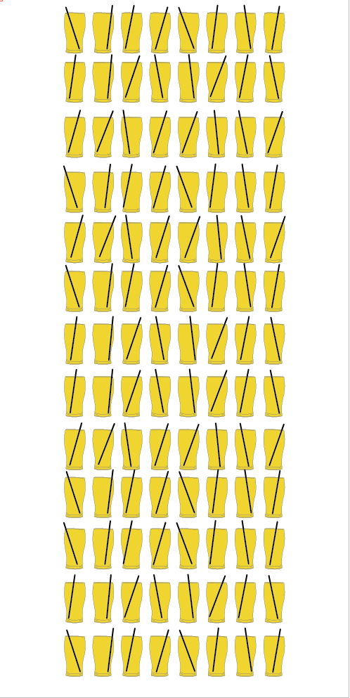
    I also had a go at producing the idea I sketched where it had a series of pint pots with straws in them set in a layout over the page.


    I think the image idea on this is a strong one with the issue I am dealing with, but I don't think as a poster it works. It just looks rushed and put together at the last minute basically, and I am wanting a really strong visually pleasing piece.


    We have a progress pin up of what we have produced so far, so I printed out the top two poster ideas I have produced to use, and then I can also ask peoples opinions on which they think is working the best in response to the crit.

    I printed out them both on A3 in black and white (because to print colour in the mac suites is a bit expensive) to see if they work to the right scale, and I did 2 printed on A4 to see if the colours that I have selected is working. 

    A3 black and white versions.


    A4 colour versions.


    Tuesday, 2 November 2010

    No News Is Good News - Ideas

    Once we presented the research we made to our blog groups we were to come up with one fact and one opinion in relation to the article we chose.

    Opinion - Underage drinking can't be tackled but can be controlled.
    Fact - A total number of 92 000 children and young people under the age of 18 were admitted to hospital between 2002 to 2009. That's an average of 36 a day.

    The fact then had to be wrote big on a card and will not be the source to the work we produce for this and the next brief.


    With all the research I made over reading week in mind, I got straight on to sketching down my initial ideas that I got once we received the brief.


    Once I felt I had a sufficent amount of ideas to start with, I went on to try out the image of the lager bottle close with the children's drinking thing on the top. I wanted to try doing it as a vector image because I have always wanted to have a go at doing it, but never knew how to do it properly (so that it looked right until we did the Illustrator inductions. So I got stuck in and produced this...


    ...and it wasn't until 3 hours later after getting to this stage that I realised that I couldn't use it anyway because the brief asks for 2 colours plus stock, and this uses at least 8 colours. I was gutted.