
I am using Illustrator to produce this, using the skills and techniques learnt from the Illustrator inductions we have had. Here is the development of this..
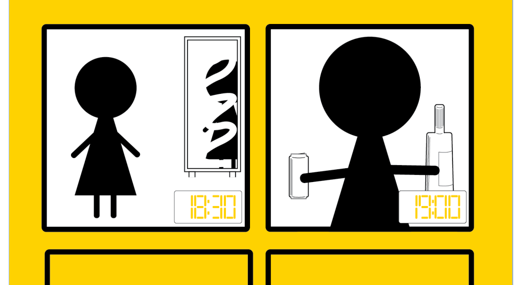
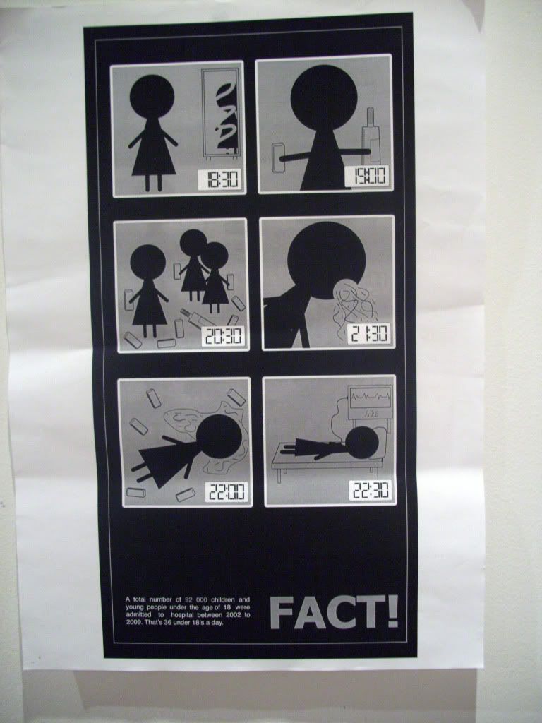
I have decided to use black and yellow as my 2 colours and white as the stock colour. I have chose these because when I see them working together it gives me a sense of more of a warning feel rather than a stop feel, which is more what I am wanting to achieve.
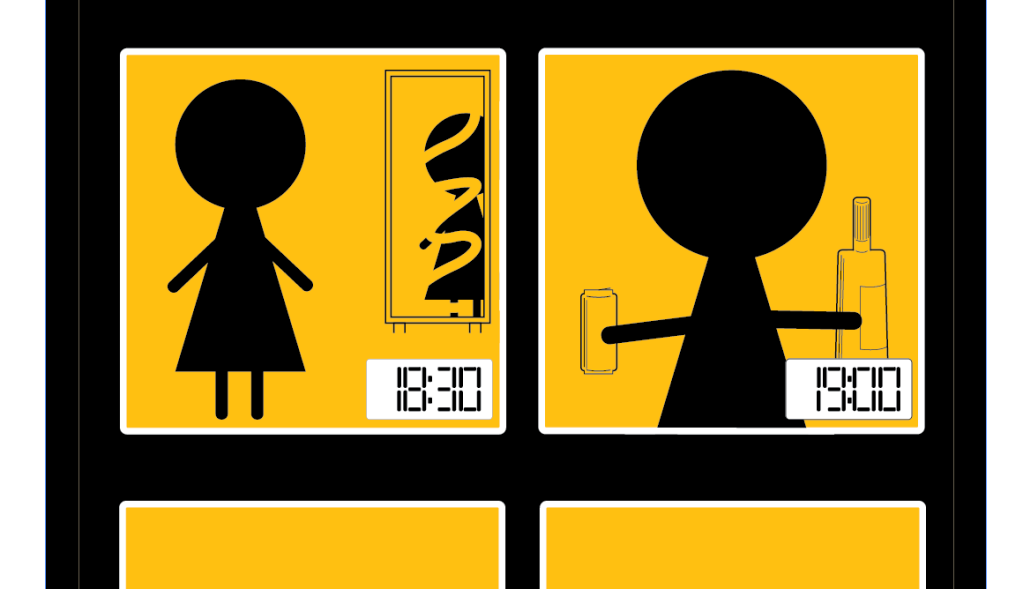
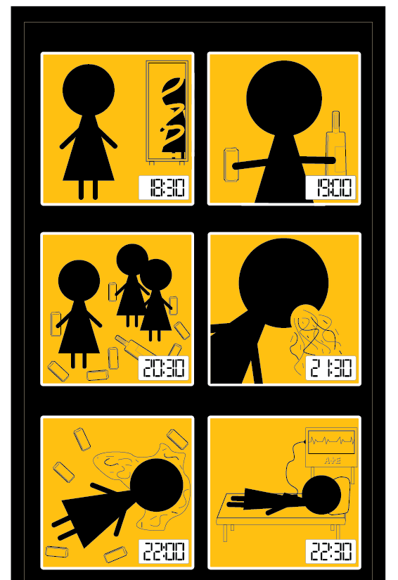
I have included the time as a digital clock in each of the bottom right corners in the sequence to give a good idea of what is happening at what time.
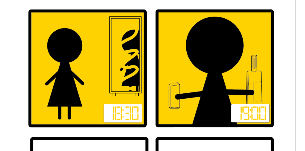
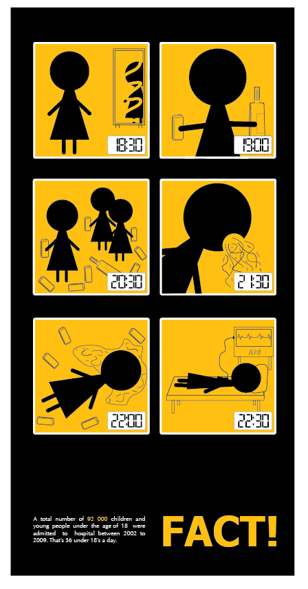
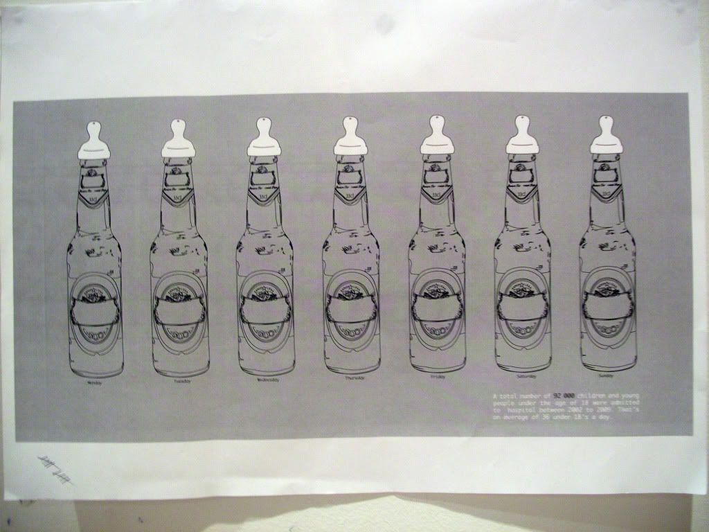
I changed the yellow to a more orange/yellow colour because I think this works stronger with what I am wanting to achieve from looking at it.
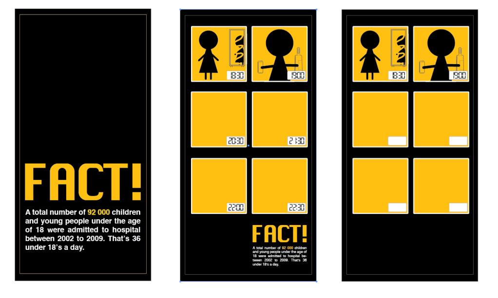
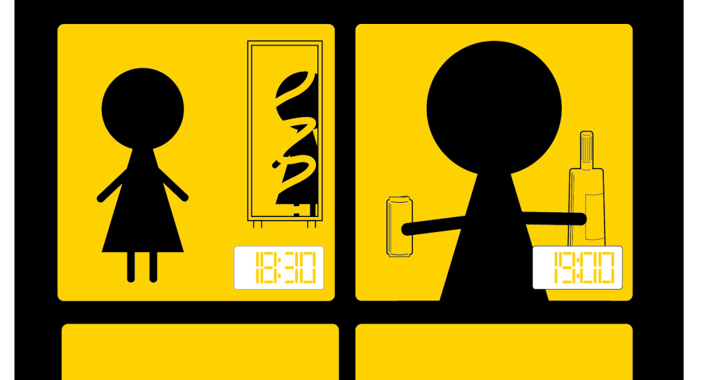
Before I went on to produce each of the squares, because they were turning out to be quite time consuming, I produced all 3 posters as a set to see if they were working so far, and if they were as visually appealing as I am anticipating. I think they are working quite well.
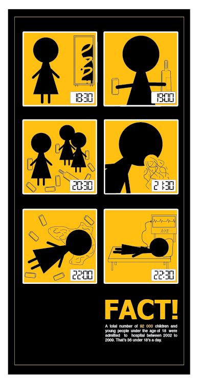
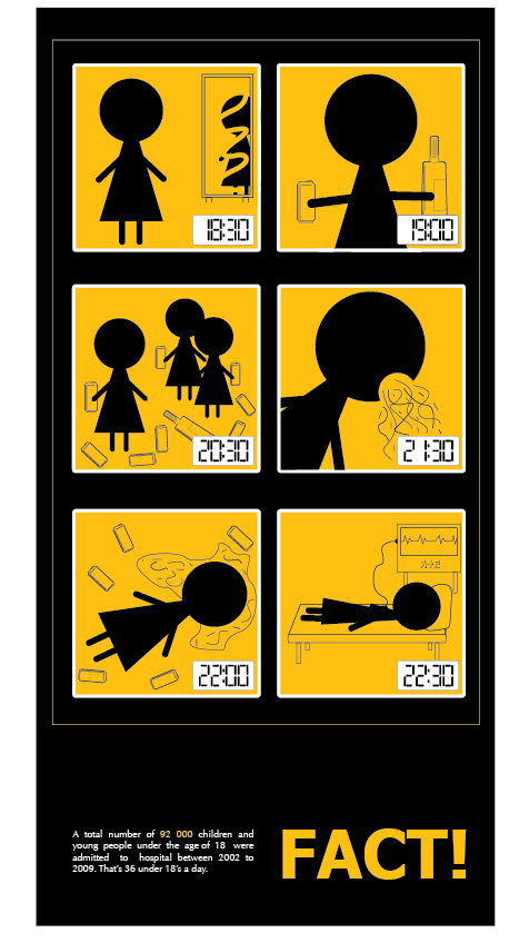
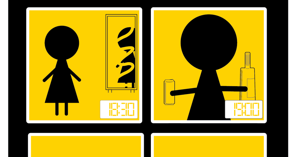
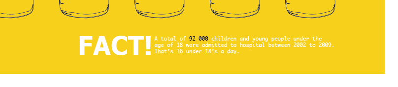
Here is the finished poster for the type and image one from the set I am designing. I think it works quite well, and is immediate with the message of the poster.
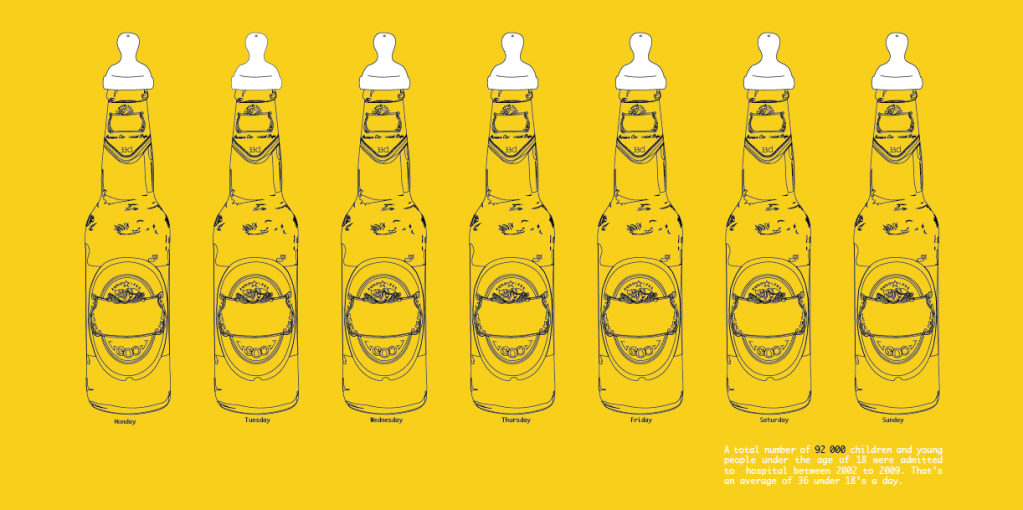
I don't want the bottle illustration that I made to go to waste, so I spent a little while changing it so that it was in a simple black and white format. I also added the child's drinking top to it to see how effective it will look like this. I also gave it the orange/yellow background colour because these are the colours that I am definatly going to use for this brief.
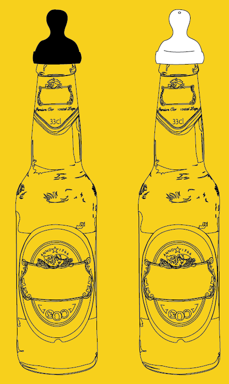
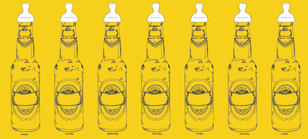
I weren't sure whether to have the top a solid black or black outlines with a white fill colour, but looking at them both together I think the one with the white fill colour looks the strongest. So I put together a series of them in the way of a different idea I sketched.
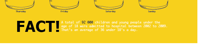
I think this works well so I put on my fact to see if it would work as my type and image poster. I used the same copy as I have on the previous poster.
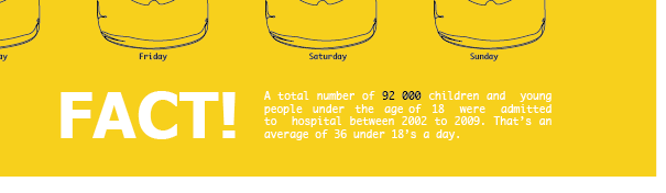
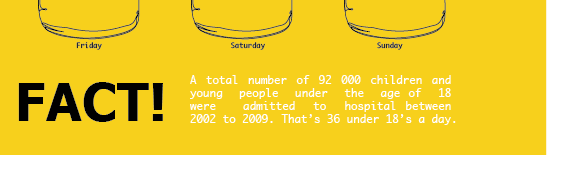
I also had a go at producing the idea I sketched where it had a series of pint pots with straws in them set in a layout over the page.
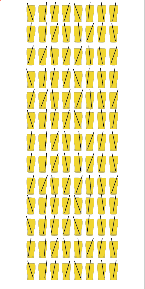
I think the image idea on this is a strong one with the issue I am dealing with, but I don't think as a poster it works. It just looks rushed and put together at the last minute basically, and I am wanting a really strong visually pleasing piece.
We have a progress pin up of what we have produced so far, so I printed out the top two poster ideas I have produced to use, and then I can also ask peoples opinions on which they think is working the best in response to the crit.
I printed out them both on A3 in black and white (because to print colour in the mac suites is a bit expensive) to see if they work to the right scale, and I did 2 printed on A4 to see if the colours that I have selected is working.
A3 black and white versions.
A4 colour versions.


No comments:
Post a Comment