
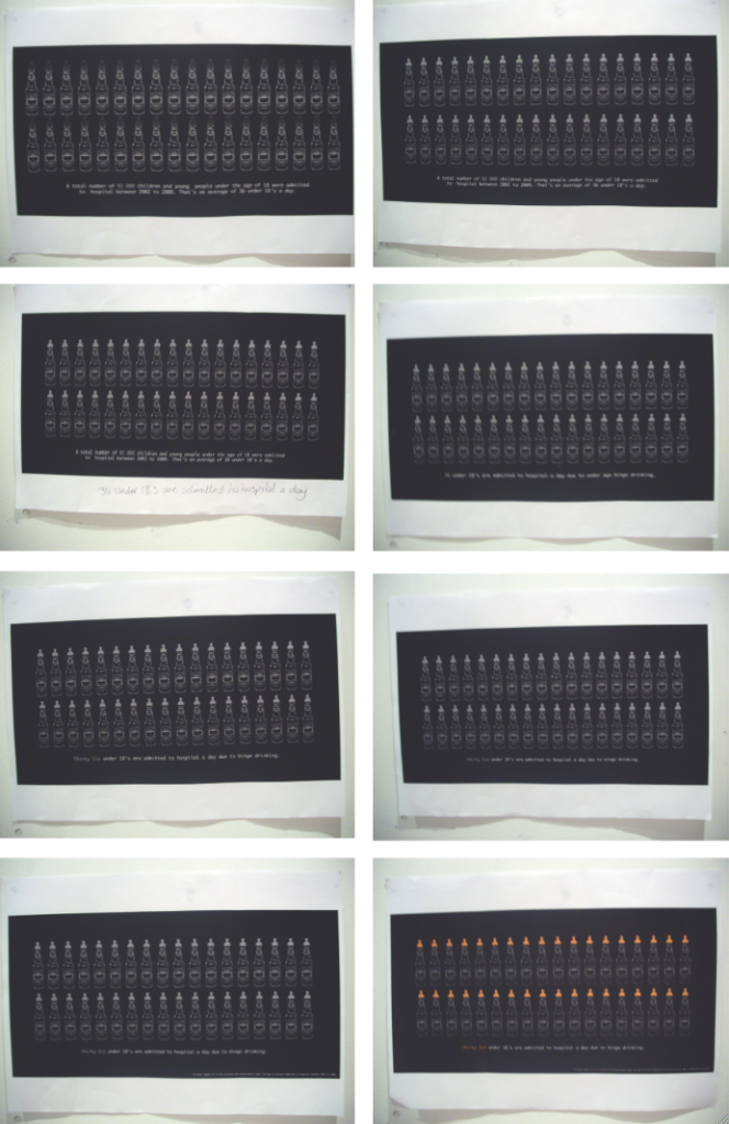
Instead of having just 7 bottles in a line across the poster, because this doesn't really link in with the fact I am communicating, I decided to have a go at putting 36 on there. 36 because that is how many young children are taken to A&E a day. As well as this I also edited little things as I was developing it (as shown). The colours are black and white again because it is too expensive to print every time in colour in the mac suite, so the black and white gives me a good idea of whether the layout is working when printed and what not. Then when I was happy with the development I printed one in colour to make sure it was right.
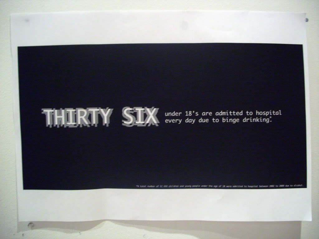
Once this was done and I was happy with it, I went on to produce the text poster. I basically just got the text from this poster and made it bigger. I also tried a blurry effect on the words 'Thirty Six' to give a sense of blurred vision which can be caused by drinking. I also then used this on the type and image poster to keep them as a set.
Then for the image poster I just took off the text from the image and type one to then use. Once I had done this, and got all 3 final posters ready for the progress crit, to give my project a more profession feel to it when looking at the posters, I went down to the Digital Print room and got each of the posters printed out down there because it is better quality, and done on Gloss paper. They look really good, although looking at them makes you not want to touch them for incase you get a finger print or a smudge on.

No comments:
Post a Comment