Sunday, 28 October 2012

Hot & Tasty - Opening Times

Taking into consideration what I have just done with the prices for the drinks, I really like the idea of having information on the icons - so I looked at how to possibly present the opening times, which would go on to the glass of the door entrance and what not.

I already have the clock vector, so I edited and experimented with this accordingly.


Considering that this would appear on the entrance door, the size of it will be relatively big so I need to redo the vector for the shop front that I lost to add this to to see (sort of) in context to see if it would work. I really like it though. Not sure if it still looks like a clock? May have to get a second opinion on that. The one that I am most happy with and believe I will go on to use is below.

Hot & Tasty - Bottle Fridge Vector

So because I have mocked up the display fridge, I figured it would be a good idea to also mock up the bottle fridge (and other things like the shop front when I get around to it - started it once and lost the file). I used the image from their facebook page of the fridge they have to copy from, and did the vector from directly in front of the fridge. 

I did it using black and tones of grey. the top blank part is for the cafe logo like they already have but the new one.


I want to make the fridge look a bit more realistic, or at least look more to scale by adding the cans and bottles to the shelves. I took the bottle and can icons that I have, and scaled them down to be in proportion with each other, and small enough to look a realistic size on the shelves, then I added them to the vector. When talking in the meeting, she said how they are now stocking more bottles than cans, so I took this on board when planning what wold go where.


I want the focus to be on the glass with this vector, as I have considered designing stickers to go on it, so I've added a light grey over the glass area with the opacity of 90% so that you can still see th contents, but not so much that they take over the design.


The main thing that I am considering for this is the prices of the cans and bottles, so I got the idea to put the prices on to the icons, using the same way with the price signs as I did on the signs previously. I just added this to the middle of the icons. I think it's effective and straight to the point.


Also, I figured seen as it's already been decided in the meeting how the sign for the outside of the shop will be, I would add this to the top of the fridge to be the same. I added a gradient to the black background on it so that it gets lighter to try and represent the fact that it will be lit up. The right one works the best in my opinion for this.


I'm happy with this process, and may come back to edit slightly what else may go on to the glass too, and also the positioning and scale of the prices too. Below is them working on their own, that I will print out to take to the meeting. I will make sure that this will be to the exact scale that they would appear on the fridge.

Saturday, 27 October 2012

Hot & Tasty - Fridge Signs Developed

Back to the signs. The big decision at the minute is gradient or not? The best way to decide is to print them out to see if it makes any difference to the designs once they are printed. So I did. I took a selection of the varieties from my experiments to compare.


The gradient is harder to tell when it's printed and doesn't really add or take away anything from the designs. I've decided to progress on using them. If I choose in the end to not have them then it's easy enough to get rid of. 

I'm liking the square designs, but don't like having all of the different things grouped together. Remembering back to the point of these, I've decided to push forward with them individual. Also, the squares here are too big, for the individual ones I can get away with using them smaller because I don't necessarily need to much space. I stripped the designs back to the basic too, and experimented with this.


I like that with this bottom image with having the icon and name of the icon being the same ties them together, and then the white used to make what it is for stand out. Using the list that I have of what's available, and considering what would be in terms of like the salad, I produced the sign for them all. Then I printed a selection of them out to see how they work once printed.


The size is spot on. Not too big and not too small. I'm really liking these. Just looking at them compared to where I got to previously I don't know if they are too plain? Even so, they are straight to the point with no confusion.

Thinking about the fridge, there's also cakes available in it, so it makes sense for these to have signs the same. I developed an icon for them that would represent cakes, then produced the labels using the same as for the sandwiches but with the relevant information.


The template translates well for the cakes ones too. Doing these though got me thinking about the prices of things. It makes sense to have it on these signs. More so for the cakes because the sandwiches would most likely come under a set price? Need to check that. So I experimented with trying to add it on.


It just feels like that extra element that's just there. Hmm. I looked at adding it to the sandwich ones anyway. WIth this I experimented with the icons a bit more, making them larger and in the background, getting the idea for this from the idea I had for the &. I printed these out too, along with some of the cakes ones too.


I'm not sure. I just don't know with these at the minute. I sort of feel like I'm kind of missing the point a bit. I don't like having the symbols like this because it's too distracting. Argh. Definitely need to go back to my initial idea for using the symbols and sort of remind myself of it again. I'll come back to this.

Hot & Tasty - Take Away Cups Initial Mock Ups

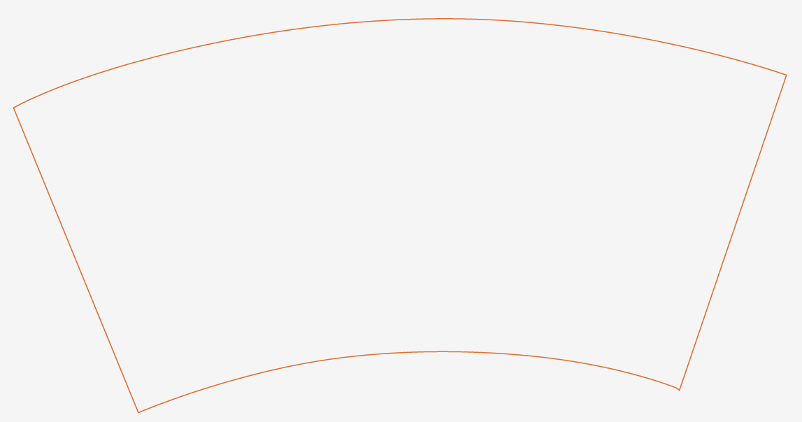
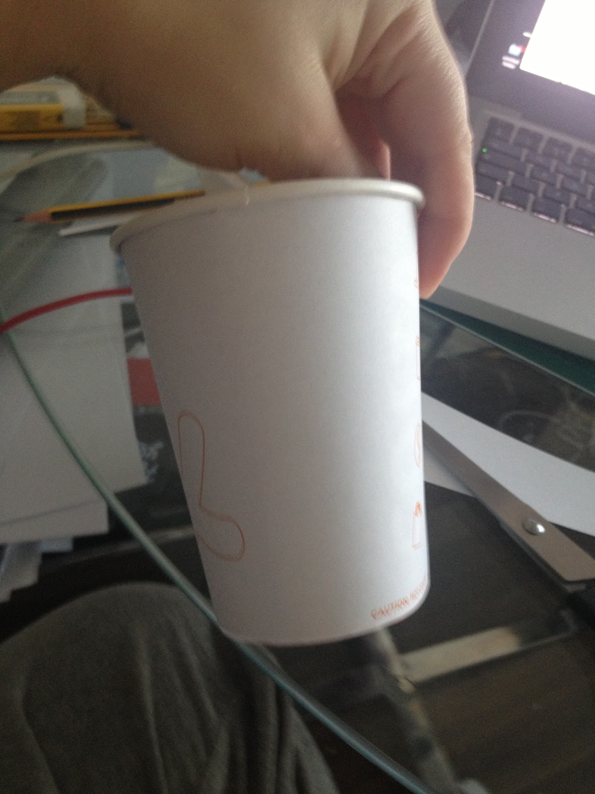
I took one of the cups I've got to use to mock up the cups that I do on to apart so I could scan it in to get the net from. 


I'm glad to be doing this because it's the best way really to see if a design is actually working. I've decided to go ahead with the designs that use the &, and have put them on to this net. I decided to try the one with just the one of each section to be opposite each other.


To print it out, I decided to just have the outlines of things. It will still give me the idea of it that I need as to whether it is working and what not, and it will also save me a lot of ink!


Now seeing it printed out, I'm not sure if having it like this is a bit too plain, so tried it with the repeat of the icons and one &.


Still not liking the large blank space on this, so going to add the second & on it. Could look a bit different if it was full colour though? 


I drew on alterations on to this one because I think this is working the best, but there's lots of little tweaks to make.


I made all of these changes. Also tried it this mock with a lid on to see if this in any way effects the design. They're white now but I'm planning on making them black.


I'm happy with where this is at now. I think it's working. The only thing really is I have lines up the bottom of the & with the bottom of the icons, so I need to make the top line up with the top of the icons because it's a tad off balance, so I changed this.


I like where I'm at now with this. I've decided to print a properly coloured version of this to see how it would properly look to make sure it's working. Didn't realise until I printed it, but I didn't colour the bottom two icons properly but will change them now. Still works though for a mock up. I also tried the lid on this one too to make sure it's still working even with them on.


 I'm liking it. I do believe that it will look better though with the black lids. Just realised though that I haven't included and black at all within the design. I'm not sure if that's really an issue though because the lid will be black. The only way to tell really is to have a look how it works once I get the lids black then make any changes accordingly.