Monday, 5 November 2012

Hot & Tasty - Carrier Bag

I want to have a paper carrier bag as well included in the take away stuff that I am producing, for the people that are buying more than one thing and need something to carry them in. I think it will be a nice addition. 

Looking at the bags that I produced in my Black & White Pattern brief, the smaller bags are a decent size, although I don't think I would want one quite so big for this brief. I only have my A4 printed to be working with at the minute to mock these up, so I have done a net that I can use to print out twice and then will stick together. I have reduced the size of the example bag I mentioned to more of a size I think would be suitable. Before I started though, I sketched up a few ideas.


Again, as I did with the cups, I'm using just outlines rather than block colours for the mock ups so that I don't waste too much ink but still get a good enough idea.


It's a bit hard to get a good enough idea working at the actual scale with this and using just the lines. I've decided to scale down the bag proportionally to fit within the A4 size to give me a better idea on how the bags would work.


Judging from this, I quite like this design. It works across all 4 surfaces so looks quite abstract, but from rotating the bag it becomes obvious what it is. I've decided to print out a full colour version because I think it will be easier to work out how well it is working, and with it being at a smaller scale it shouldn't be too bad.


Needs scaling down a tad, bit too abstract on the areas for what I am wanting to achieve, so scaling it down will allow me to have more of the & on the design areas. Instead, I'm working on having the & fit within the two large areas and one of the smaller one, freeing up the last smaller edge for me to add some icons to.


Definitely think the & works better at this scale. And having the icons work down the side works well too. I tried adding a paper handle to it to see how it would work - it does. I am not sure if I would want them white or orange though. Also I need to figure out how to do them properly.


I'm pretty happy with how this bag is at this stage, so I decided to print out a larger to scale version to see if it works like that.


Yep, it does. There's a couple of little design flaws that I need to sort out on it but for a mock up it works fine. I'll make sure that I get them sorted out.

Friday, 2 November 2012

Hot & Tasty - Shop Front

For the mock ups to present to the owner, I've decided to mock up the front of one of the cafes then explain how the elements will also be transferred to the front of the other in pretty much the same way.

When I mocked up the front of the cafe at first I did it from the angle like one of the images that I have of the cafe, but taking into consideration that I just want it to be an example of what I am meaning I realised that having it at an angle wouldn't allow me to do this to the best that it could be to illustrate my ideas.


So I did another trying to get it from straight on in front. I've tried my best to keep everything in proportion to each other as they are actually. 


I haven't got anything mocked up as of yet on this, but it's ready for when I start to do so.

Hot & Tasty - Toilet Door

Something that I keep mentioning on my DC blog is how important the little details are with projects, and that's what I think takes them from being alright to being great. So with this in mind, and as well as the fact I have all of the different icons to use, I've got to thinking about the little details around the inside of the cafes that could have something included on them, such as the toilet door.

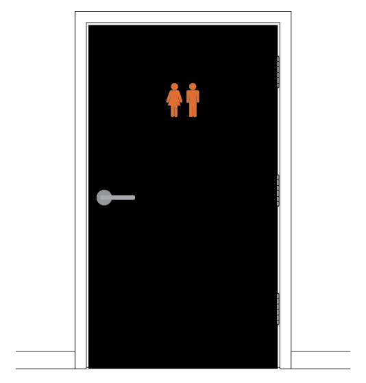
To take to the next meeting, I've decided that I will also mock this sort of stuff up too, the same as I have done with the bottle fridge, just so that I can explain my thought processes with them. So the first thing I decided to mock is the toilet door. I made this up on Illustrator, then added the icons to them.


There's the choice between having the man and woman symbol or the WC symbol. I tried both. This would be a decision for the owner to make. I just put them relatively small in proportion to the rest of the door in the top center that would be an average eye level height for most customers. I have put them in orange. I am not entirely sure what colour the toilet doors actually are, so I have just left them white on most of the mock ups, but did one in black to maybe suggest having them black? Not really a decision that may be appreciated though, but is at least considered.

For the meeting, I'll print out examples using both the different symbols to take along for them to make a decision on.

Hot & Tasty - Take Away Cups More Further Development

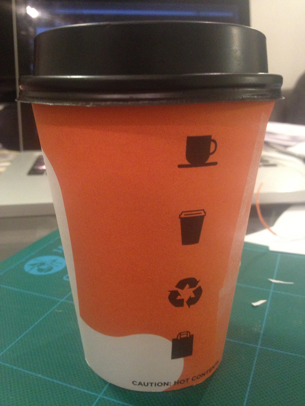
Looking at the take away cups I'm using to mock mine up, they all have the recycled logo on them, so thought it would be a good idea to include it on mine. So I've added it to my icons.


Then added it to my last mock up designs that I ended up with. I took off the coffee bean icon because the cups will be used for both tea and coffee so figured that this makes sense. I think this new one looks better too.


I've decided to shift the white & around the cup slightly so that the black icons fall more into the orange gap between each side of it on the cup.


I've had another quick experiment with the logo. Considering all the ones that I have seen actually out there working, more or less all of them have the logo especially if it is text going vertically down the cup. I never really thought anything to it really, but now I get it - it's because to put it horizontal around the cup means having to work out the curve that it would need to be at so that once it is printed and working as an actual cup it still looks horizontal.

So, baring this in mind, I thought I would follow this tact and have my logo going vertical down the cup too, so that it will be on the opposite side of the cup when mocked up.


 I'm pretty happy with where I am at with these now. I'm not entirely sure if it needs the logo on the cup or not, so as I have said previously, I'll take both of the mock ups that I have now to the next meeting and let the owner decide.