
To take to the next meeting, I've decided that I will also mock this sort of stuff up too, the same as I have done with the bottle fridge, just so that I can explain my thought processes with them. So the first thing I decided to mock is the toilet door. I made this up on Illustrator, then added the icons to them.


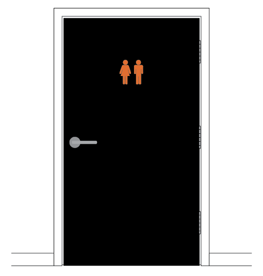

There's the choice between having the man and woman symbol or the WC symbol. I tried both. This would be a decision for the owner to make. I just put them relatively small in proportion to the rest of the door in the top center that would be an average eye level height for most customers. I have put them in orange. I am not entirely sure what colour the toilet doors actually are, so I have just left them white on most of the mock ups, but did one in black to maybe suggest having them black? Not really a decision that may be appreciated though, but is at least considered.
For the meeting, I'll print out examples using both the different symbols to take along for them to make a decision on.

No comments:
Post a Comment