
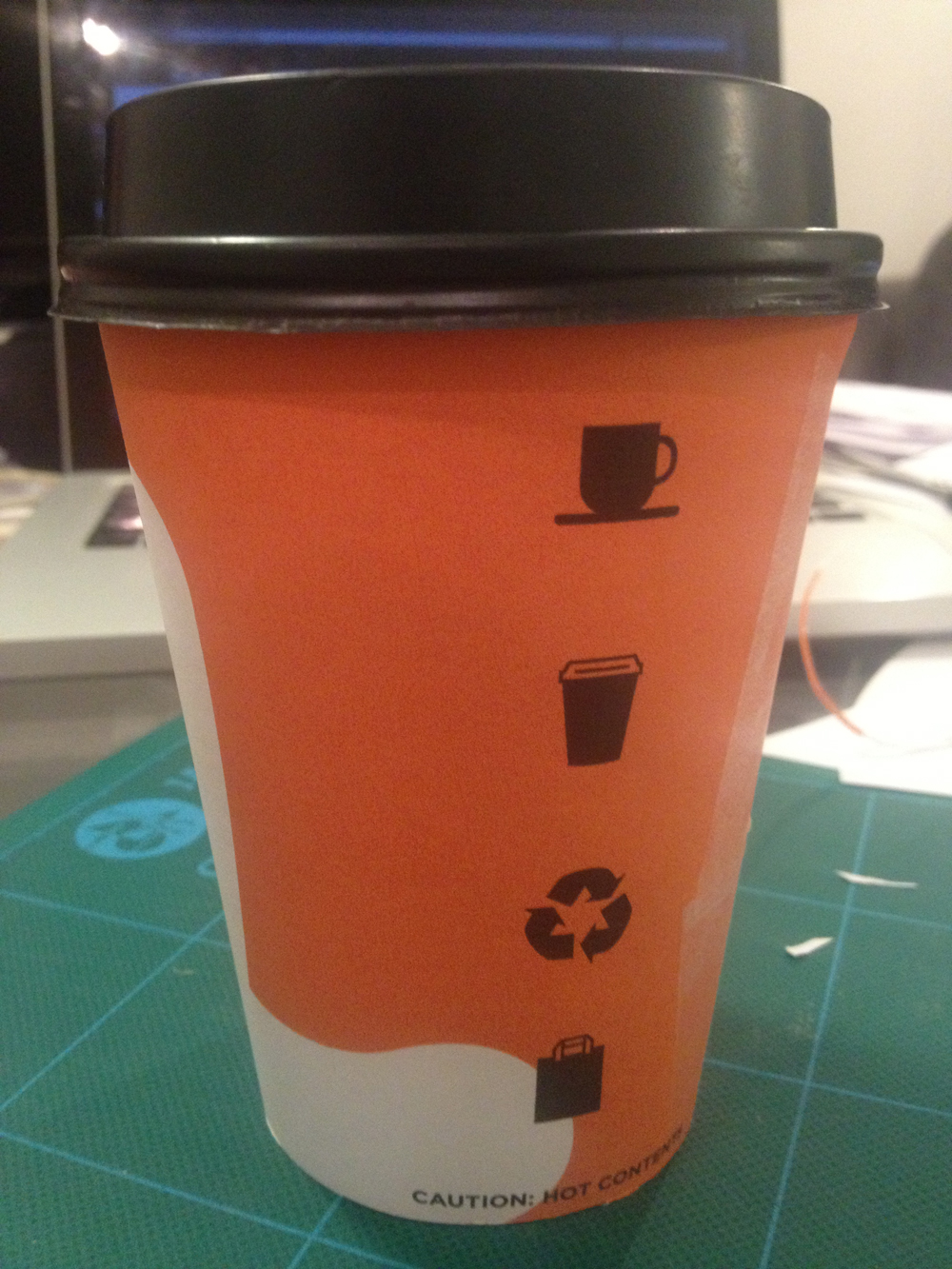
Looking at the take away cups I'm using to mock mine up, they all have the recycled logo on them, so thought it would be a good idea to include it on mine. So I've added it to my icons.

Then added it to my last mock up designs that I ended up with. I took off the coffee bean icon because the cups will be used for both tea and coffee so figured that this makes sense. I think this new one looks better too.


I've decided to shift the white & around the cup slightly so that the black icons fall more into the orange gap between each side of it on the cup.


I've had another quick experiment with the logo. Considering all the ones that I have seen actually out there working, more or less all of them have the logo especially if it is text going vertically down the cup. I never really thought anything to it really, but now I get it - it's because to put it horizontal around the cup means having to work out the curve that it would need to be at so that once it is printed and working as an actual cup it still looks horizontal.
So, baring this in mind, I thought I would follow this tact and have my logo going vertical down the cup too, so that it will be on the opposite side of the cup when mocked up.


I'm pretty happy with where I am at with these now. I'm not entirely sure if it needs the logo on the cup or not, so as I have said previously, I'll take both of the mock ups that I have now to the next meeting and let the owner decide.


No comments:
Post a Comment