
I made some initial bottle design research before we began to give us some starting ideas on how to have it. We have decided to go for a simple tall bottle shape, and the label will either be printed directly only the bottles, or the labels will be transparent so that the colour of the drink and actual contents will show through.
In order for us to get a good idea on how this could work, Beth matched up a colour for us to use that is pretty much the colour of the actual drink.

We encountered a problem straight away just by adding the logo on to the colour of the liquid. With the colours in the logo being so dark, they don't really stand out, so Beth made a few tweaks to see what works the best. The middle one from the three above is what we decided to go with. So from now on the decision is that when a logo is being used on a coloured background, the dark background area will be white, and the colours of the letters will be made transparent.

Again, with the colours in the description, when added on to the coloured background the hierarchy of them reverses out. We changed the really dark words for the flavours to be white, but it still doesn't really work as well as we originally thought it would. So we decided that it would be best to make the full description white instead (shown below). We considered having a different lighter colour for certain words, but in the end we decided on just white.
The rest of the bottle information was added as well.
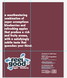
As well as having the description so that it would all be shown at the front of the bottle (thanks to Beth's awesome maths skills working out the area of that), we also considered having the text do a full wrap around the bottle.

Not being completely sure which we think would work best obviously from looking at them flat on a screen, we decided to print them out to get a better hands on feel. Where as we were leaning more towards the full wrap around option from looking on screen, as soon as it was printed and wrapped around we immediately decided against it.
The full process and development of this is on Beth's blog. A few tweaks and changes need to be made from now on the labels but we're pretty set and sure with how it's going to go.
No comments:
Post a Comment