
Due to the results of the taste test that we held, the biggest reason people chose for choosing to buy a drink is that they know what the drink actually tastes like. We had an initial idea similar to this where we would describe the taste of the drinks on the bottles, so we have decided to pursue this idea.
For the typeface for the descriptions that we will be using, we want to have one that is more hand written than an existing one. We don't just want to look on a website to download one so have decided to just make one instead.
Instead of just drawing letters and hoping they turn out ok, we decided that we will use an existing one that we like and trace around this to give it a hand drawn look instead. Following the previous typeface test to decide what we would use, we decided to use the bolder one of that to trace around, so I printed it out both uppercase and lowercase and traced it off.
I began by following it exact but making sure that I wasn't too concentrated on getting the lines right so that it did turn out hand drawn.


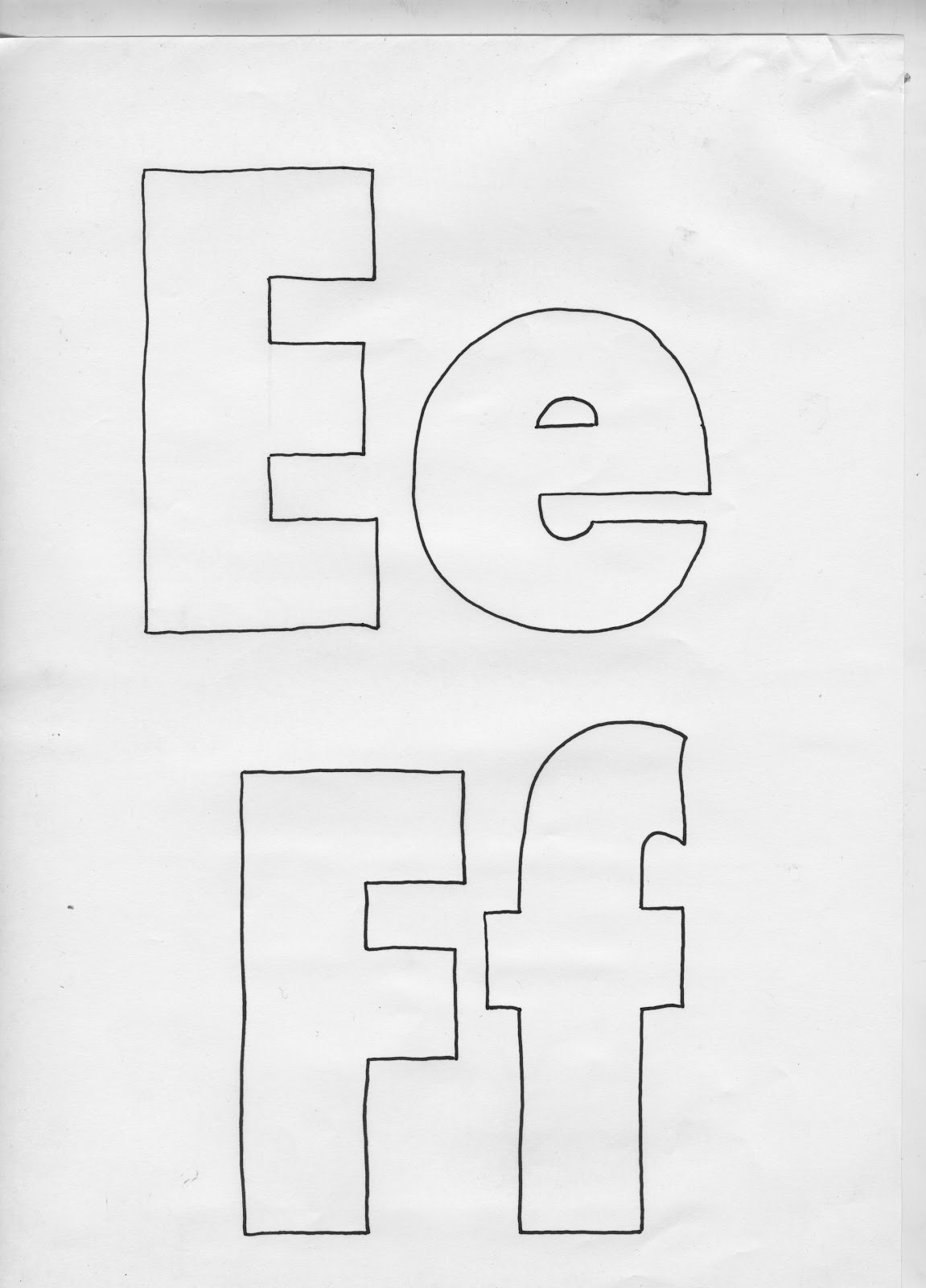


About half way through tracing out this typeface, I realised that once we resize it down to the actual size that we will be using it it probably wont look any different at all so I decided to give it a go at rounding off the corners instead.

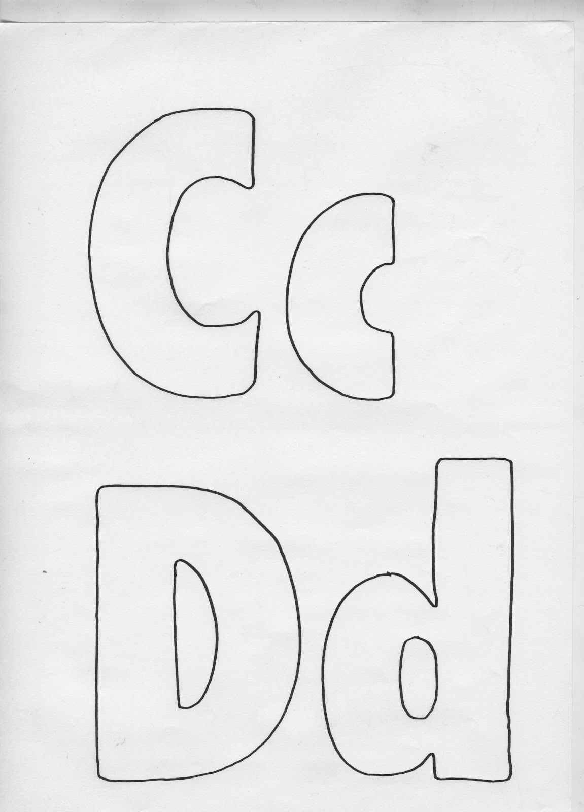


The rounded typeface looks more hand drawn than the normal one that I originally did and I think that it will look better and more what we're looking for once it is digitised. I scanned the drawn letterforms in (shown above), and using the pen tool on illustrator I traced around them. I started with the rounded version first as I do think that this will work the best, but I will also have a go at the original one too.
Here's the digitised uppercase rounded hand drawn typeface.


Here's the lowercase rounded hand drawn typeface.


The full typeface.

Rounded hand drawn letterforms.

Rounded ampersand

No comments:
Post a Comment