
Now that I have basically the finished design for the folders, I don't really feel like I should use the colour wheel wall calendar. As much as I like it, I think a more simple 'normaler' one would better suit. So before I got to designing this, I started to work out what sort of size to have the sections for each of the days to make sure they will be big enough to write in and what not. I printed out a vareity of different sizes to see what would work the best. Also, I looked closely at the wall calendar I have up on my wall to see what little elements they used that made it to make it work.


Once I decided on a couple of sizes, I started working out what the whole area for this would measure to on the calendar, to see the sort of scale I would be working to and what paper size I would need. While I was working this out on paper, I also did it on Illustrator at the same time.


Now I basically know what I will be working with, I sketched out really quick the idea of how I would like it to look, as well as sectioned off the right area I will be working with into how it will fundamentally look.


I don't really think that is working, and think it is a little 'too normal'. I want to have something that is just a bit different so I changed the format of it to be portrait, rather than landscape. Also, I started working into how I want it to look more so began to change the designs.


I experimented with having the calendar on a smaller artboard, to see if this would work better than the A1 one.

I continued editing the designs as I weren't really feeling anything I have done so far.


I stopped working on the calendar at this point because I just weren't happy at all with what I was doing and just think it was looking shit. I reflected back over all the research I had made so far to try get some inspiration for how to continue with this. After a while, I started to experiment with some basic 'graphics' elements like circles and lines, and once I started doing it I realised it worked quite well and decided to do it across the whole poster.


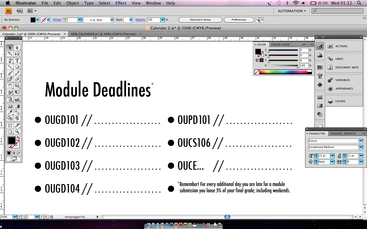
Having the module deadlines on the calendar is one of the main reasons for the calendar so that the student doesn't forget what is coming up. As well as writing on the studio deadlines and what not. I have made a section at the bottom of the poster for the module deadlines though so they can find them instantly as well as search through the calendar for them. Because I don't know when they will actually be as they may change slightly next year, I left them as the dotted lines (visually linked back to the folders) so that the student can write them on as they get them.


Once I was happy with this I started working on the sort of 'title' for the calendar, where basically it will have the course name and academic year there.


I decided to change the month names section to be reversed out, so the section is black and the writing is white. I think it holds the calendar together better as a whole, and gives it a little more. As well as changing the header.


I added a 'holidays' section to the bottom of the calendar for the student to use to either write down reading weeks and what not, or to write down any holidays or places they will be going. This will keep it linked to the quote more with it saying how having a social life is important too.


I decided to add the different bank holidays on to the calendar as well, so I googled when they would be and put them on.


The finished calendar looks like this.

No comments:
Post a Comment