
I began by drawing out numerous circles which would be the start to the colour wheel, which after will be edited as suits. I measured them out so that they are all the same with the same width between, and made the lines 30 points. I printed out a section of it then to see if the area within the lines would be big enough to write things like module deadlines. I also put on the lines to split the circle into 12 sections, one for each month.


This turned out to be fine, so I got an example of a colour wheel from Google to save time having to work out the colour of each section myself, and began to change it into the colour wheel.


I like the way that on the example one I have gets darker towards the middle, so I decided to follow this and have mine do the same.


I decided not to go so far into the center with the colour circles as I think it would work better with a bigger center so I stopped at a certain point. I put on the month names above each of the sections and put a quick couple of lines in the corner to see how the thing looks overall.


I am happy with how it looks, so I worked on splitting the sections into smaller sections for each of the days within that month. I want to keep them a decent size so that they are big enough to write in and it be clear. At the same time I kept experimenting with the few lines of body copy I have, as well as experimenting with the lines separating each of the months sections.

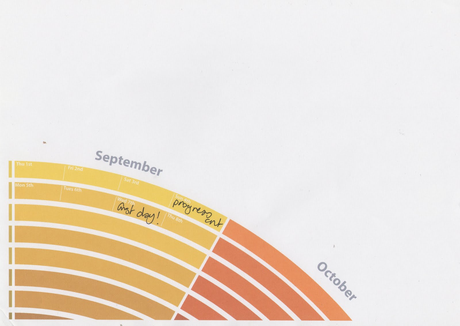
Once I finished the September section I printed this out to make sure that it would look right.


I weren't really keen on having the month names around the circle like I had them so I experimented with different ways to have them.


Considering how to have the body copy I would need on the calendar to link it with the rest of the things in the pack, I decided to experiment with changing it from being landscape to portrait, and I prefer this a lot better.

The actual colour wheel looks like this.

I am happy with how this looks, and with positive comments from others on the course assures me that it would be of interest to a student next year. Even so, I am going to leave it as it is for now to concentrate on the designs on other things and see if they would be a design that could work across on to this, if so then I will use it, but if not then I may have to look into doing it different.
No comments:
Post a Comment