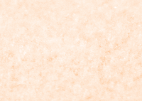
Texture 1
This is the first texture layer I am experimenting with:
I first tried out with this layer over the orange layer (I'm explaining all of this out for if I want to come back to one at a later time).
I like the bottom right one from this, which is using the luminosity blending mode.
The colour layer above the texture layer.
Again, I like the bottom right texture from these, which is the colour layer on top of the texture layer using the colour blending mode.
I experimented with the opacity of the texture layer under the colour layer with the bottom right blending mode, to see if this makes any difference to the texture to possibly make it better. I tried it with 100% opacity, 75%, 50% and 25%.
To use as just a background colour, this would work really well. I'm not exactly sure on the design aspect of what I am going to produce yet, but this is certainly something to consider.
Texture 2
This is the second texture I am experimenting with:
Texture layer above the colour layer.
I like the bottom two from this one. The left is the overlay blending mode and right is soft light blending mode. This hasn't really shifted the actual colour of the orange so much so wouldn't really work as a background colour, but could possibly replace the colour orange with one of these to add texture to the designs that way instead? Something to consider.
There wasn't really any that I liked from having the layers the other way around.
I can't really find more textures to work with. I need to start making more decisions and fast so that I can pull everything together that I have so far.


No comments:
Post a Comment