Friday 22 October 2010

Alphabet Soup Illustrator - Third Session

These are the notes that I made from the third and last Illustrator Induction. In this session we learnt how to save a document for either screen or print.

Preparing For Print
When setting up a document for print it is important to first check 4 things:
  • Document/Artboard Size - for this brief that is A1 (594mm x 841mm)
  • Resolution - print 300ppi, screen 72ppi
  • Colour Mode - print CMYK, screen RGB
If a colour is not in the CMYK printing colours it is called 'out of gamut'. The way to see whether a colour right to use in Illustrator, you can check by looking on the 'Colour Picker'. If the top box at the right of the pallet has a triangle warning above it then it isn't the right one.

  • File Formats - certain file formats are suitable to save when the image is intended for print and others for screen.
The file formats that are saved for print are called 'lossless' because they are uncompressed. File formats that are saved for screen are called 'lossy' because they are compressed.


File Formats
The file formats that are used for screen are
  • .jpeg
  • .png
  • .gif
The file formats that are used for print are
  • .Ai - Illustrator file
  • .Psd - Photoshop file
  • .Ind - InDesign file
These 3 are software specific formats. They are good to use when working on something, but not when sending off to the printers because
  - someone else could edit it.
  - someone else could steal it.
  - the printers may not have the right software to open it.
  • .tiff
  • .ps
  • .pdf - portable document format
  • .eps - encapsulated postscript file
The bottom 2 formats are the 2 main industry file formats used when sending them off to commercial printing.

Tuesday 19 October 2010

Visual Language - Visual Vocabulary Descriptions...

Here is the work that I produced in the Visual Language session on 19/10/2010.


In this session we went over the definitions for things such as nouns, adjectives, etc. Followed by creating our own sentences, then re wording a couple of newspaper articles and finishing off with a few riddles to solve.


Definitions:
  • Verb - doing word. eg, 'running'.
  • Adverb - describes the verb. eg, 'running fast'.
  • Adjective - describing word. eg, 'beautiful'.
  • Noun - naming word. eg, name of a person, animal, place, object, etc.
  • Pronoun - actual names. eg, 'Jemaine' the goat.
  • Subjective Personal Pronoun - the subject is acting as the subject. eg, he, she, I, you, it, we they.

Own Sentences:


This sentence has an adverb, verb, noun and adjective.

'The little cat was jumping high.'
  • little - adjective
  • cat - noun
  • jumping - verb
  • high - adverb

This sentence has a pronoun, verb, adverb, subjective personal pronoun and adjective.

'John was printing badly, it looked rubbish.'
  • John - pronoun
  • printing - verb
  • badly - adverb
  • it - subjective personal pronoun
  • rubbish - adjective.


This sentence has 3 nouns in it.


'Late last year, our neighbor bought a goat.'
  • year - noun
  • neighbor - noun
  • goat - noun

This sentence has 2 nouns in it.

'Fred Bates is a tutor.'
  • Fred Bates - noun
  • tutor - noun
This sentence contains all 6 elements in it.

'This morning, Lisa and Sarah are discussing quietly and carefully their visual language problems.'
  • morning - noun
  • Lisa, Sarah - pronouns
  • discussing - verb
  • quietly - adverb
  • carefully - adjective
  • their - subjective personal pronoun

This sentence also contains all 6 elements in it.


'Barry and his animal pals ran quickly into visual language to learn about nouns.'
  • Barry - pronoun
  • his - subjective personal pronoun
  • animal pals - nouns
  • ran - verb
  • quickly - adverb
  • visual language - noun
  • learn - verb
  • nouns - noun.

Re Wording Newspaper Articles:


For this task we were to take the article from a newspaper we were given and shorten it down to 140/160 characters.

The first one I did was this one:
This one was to be shortened down to 140 characters, as though it was going to be posted in a 'tweet'.
Here is what I got, I managed to get it to exactly 140:

Katie off X Factor reads things written about her to get people to like her. She's making amends after a story of her and Matt being in bed.


The next article I did was this:

This one was to be shortened down to 160 characters, as though it was being sent out in a text message.
Here is what I got, I managed to get exactly 160 characters:

Sir Alex Ferguson refused to talk about Wayne Rooney saying he don't want to sign a new contract with United. It is rumored that Barcelona and Chelsea want him.


Riddles:

Six letters it contains, subtract one and twelve remain.
   - dozen/s

I'm safe and secure, behead me I become a place of meeting, behead me again and I am the partner of ready, restore me and I become the domain of beasts.
   - stable

How is it possible to always find what your looking for in the last place you look?
   - because you stop looking after you find it.

A black dog is sleeping in the middle of a black road, no street lights, no moon. A car comes driving down the road with no headlights. How did the car know the dog was there?
   - it was daylight.

It walks on 4 legs in the morning, 2 legs at noon and 3 legs in the evening. What is it?
   - man.

Alphabet Soup Illustrator - Experiments

I was practicing some of the skills that I have learnt from the Illustrator Induction sessions we have had and decided to create some my possible manipulated letterforms to use for my finals.

I came up with an idea to manipulate certain body parts into a lowercase g. I wanted to keep them simple and followed the brief with it saying we can use just one colour, so I used the same within each (where needed).

Here is the letterforms I just created and experimented with.


After looking back over the brief that I am using to respond to with these, I am not sure if they would work well in response to it because I don't know if it has to relate to the Alphabet Soup Part 1 brief we did. So I asked Amber and she said it doesn't, and we can literally do what we want for this so long as we end up with the 26 manipulated letterforms. I showed her these experiments that I have done, and she said they are good, and to maybe try as well as this to push the actual letterform as far as it would go as well until it is only just legible. 

So, before I make more of these or try something later, what I first need to do it to work on manipulating the actual letterforms and pushing their boundaries, and go from there really.

Monday 18 October 2010

Alphabet Soup - Further Development/Crit Response

Following the feedback that I got from the crit, I produced a digital version of my lowercase typeface. To do this I created it on Illustrator, using the skills and techniques I have learnt from the Illustrator inductions we have been having for the Alphabet Soup Illustrator brief.


Once I did this I experimented with spelling out different words and phrases using it.


Alphabet Soup -Final Crit Feedback

Here is the feedback I got from the final crit we had on 15/10/2010.

Issues Raised

  • N/A


Action To Be Taken
  • try using the typeface to spell out different words and sentences to see if it works like that.
  • maybe try adding some elements of colour into the design.
  • try producing a digital version.
  • try out the same design that I did but on a different existing typeface.

Friday 15 October 2010

Visual Language - Visual Vocabulary Sequence/Narrative

Here is the work that I produced in the Visual Language session on 12/10/2010.


First we had to create a series of 5 frames using the letter A's we were given to communicate a certain word. I produced 3 of these. Here is how mine turned out.

Skip:

Rush:

Stop:


Then we got into groups of 4, and did basically the same again but this time across a series of 20 frames using the letter A's we were given to communicate a certain word. We produces 2 of these. Here is how they turned out.

Rush:

Skip:


From this session we learnt the importance of positioning something within a frame to make it look most effective.

Alphabet Soup Illustrator - Second session.

In this session we learned

  • more about the pen tool.
  • how to make shapes to produce letterforms not using the pen tool.
  • how to scan images to trace on illustrator.
  • how to fill shapes once drawn using pen tool using colour/patterns.
  • how to create own patterns to use.
Because I know what I am like for loosing things, I am going to type out my notes I made from this session so just incase I come to needing them again I know where they are.


To scan...
Scan images only using 'Image Capture' - it can be used for everything.
  - before actually scanning you must check the settings for the scan, because if not it will scan for screen.
      - open settings.
      - change resolution to 300 (for print).
      - save file to user work.
      - change format so that it saves as a .tiff.
      - always do overview before scanning to select areas.
      - then scan.


Open scan to use in Illustrator...
The image that is scanned always saves as a bitmap image, and it needs to be a vector.
  - to start, open Illustrator and set up a new document.
      - file - new document.
          - set profile to print.
          - set colour to CMYK.
          - set resolution to 300.
      - when opened a new file, go to...
          - file.
          - place.
          - select the scanned image.


Trace a scanned image on to Illustrator...
Before starting to trace the document needs to be set up properly.
  - click on the layers panel on the right side of the screen.
  - create a new layer.
  - lock the background layer (which should be the scanned image) and
    double click on it to change the dim to 50%.
  - rename layers to appropriate names.
  - zoom really into what is being traced.
  - set up the colours properly so that the line colour is black and the fill
    colour is set to transparent.
  - use the pen tool to draw round the image.

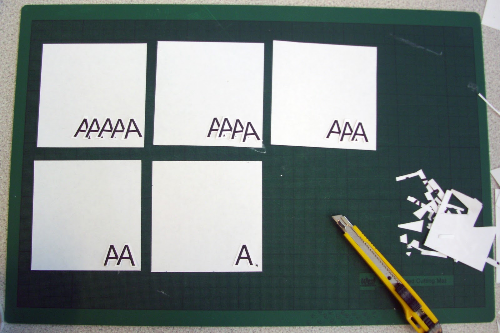
Here is my letters that I produced while tracing on Illustrator using the pen tool.


Create not using pen tool...
For this we use the shape tool from the pallet on the left.
  - select the elipse shape.
  - start drawing from center point by holding 'alt' key.
      - use selection tool to change and move paths and angles of the curves until achieving right shape.
          - basically draw with it then use white arrow to alter paths to make right shape.

Here is the shape I produced using this technique.


Fill...
Select the shape you want to fill and change the fill colour to what you want it to be.
  - on shapes with counters (like my Q), it colours in all the area.
  - need to use the counter shape to cut out of the outer shapes fill.
  - to do this you use 'Pathfinder'.
      - go to the window drop down menu at the top of the screen.
      - select path finder.
          - have the counter shape above the outer shape.
          - select both shapes together.
          - press the 'Minus Front' button on the Pathfinder menu.

Here is how my Q looks after I filled it.


To add colour...
To do this you can either,
  - use the colour bar on the right (CMYK).
  - or the swatches bar also on the right.
      - in swatches you can choose category for colours.
      - use colourbook.
      - it also has patterns.
          - lines.
          - dots.
          - etc..


Can make own pattern to use...
When ever you do this it should always be done within a square.
  - set the fill colour of it to white.
  - do the pattern within a big square then when it is done, make it smaller.
  - delete the existing swatch colours in the pallet.
  - then drag over the square into the pallet, and this now works to fill shapes.

Here is a pattern I made to use.


And here how it looks on the letter Q I made.


I carried on experimenting with this for the rest of the session creating a few more patterns and using them on the letter Q I made. Here is the ones I did.


Alphabet Soup - Final Outcomes

So because I have developed both the upper and lower case versions of my typeface, and because I have plenty of time left before the studio deadline for this, I produced both version onto an A1 poster.


As well as the A1 posters I produced the 90mm by 45mm name badge which was also required. For this in the end I produced it using the lowercase designs.


Wednesday 13 October 2010

Alphabet Soup - Symbols.

As well as the letterforms we have to decide on 6 symbols to go with them. The ones that I have decided to design are ? ! * & $ @.

I chose:

? - because she is quirky and I think this symbol could (if you opened your mind to the idea) be a suggestion of quirkiness with the impression that there isn't yet an answer to what it is being used against.

! - because this would suggest that she is confident because it is a symbol that makes a line or word more assert.

* - because again I think this symbol could suggest quirkiness.

& - because she comes across as being quite elegant and this is an elegant form of symbol to use.

$ - because on the questionnaire where it asks if she could live anywhere in the world, she answered New York, and this is the sign for the currency they use.

@ - because one of the adjectives I used is well educated, and well everyone has an email address these days.


To design them, I used the same process as I did for the letterforms where I designed the basic form of them first.


Then coloured in the sections.


Then applied the line idea to them.


I think that the symbols I have selected have worked well with the designs I have used for this brief. They fit well against the letterforms, and don't just look stupid. The only thing that I would say is that the * symbol is left a little plain against the others because I couldn't really have a section of it using a block of colour because then it makes it less legible to what it is supposed to be. Even so, I like this fact because it makes it 'different', which is also an adjective I used to describe Charlotte.

Alphabet Soup - More Possible Development.

While I am still debating whether to actually go with the upper or lower case version of my designs, I came up with a few ideas that could be a possibility to use in place of the lines idea I am using.


The ideas don't really differ much from what I already have, but they are alternate ones for just incase I decide to change them for what ever reason. I am going to stick with the lines idea I do have for now, I just feel that it is a little reassuring to know that I have these for incase anything goes wrong.

Alphabet Soup - Crit Development

After coming to the conclusion that using the typeface for the name badge doesn't necessarily work because the letter T's and the L aren't completely legible, so my plan is to re design these letters and try the whole typeface using the lines idea I tried out during my development work, as well as using the same style to produce a lowercase version of the typeface.

I first developed my uppercase letters so that they now look better/more legible, as well as using the lines idea.


I think now that I have made these changes to the certain letters, and tried out the typeface with the lines idea it has improved it a lot, and makes it work better. The lines give it a different feel to the version without them: they make it look somewhat more glamourous and elegant, which is more like the feel I was looking to achieve.It also defines each of the letters more and helps a lot with making them more legible.


I then started doing the lowercase designs. I began the same as I did the uppercase ones by making the basic design and form of the letterforms first.


Then developed it further as I did perviously with the uppercase letters by making sections within the letters into blocks of colour.


And then did the designs including the lines.


Having both the uppercase and lowercase letters designed, I don't actually know which I prefer over the other one. There is certain elements and letters within each which makes them more favorable, so I will write out Charlotte's name using both sets of letters to see which works the best/is more legible.


As well as doing the name for each in a large scale, I also did both the actual size of the name badge to help me make a decision.


I think both the upper and lower case work for the name badge, although with the lowercase letterforms being that little bit smaller than the uppercase ones when using the same point size, it allowed me to use a bigger point size for them in order to fill the name badge space well. Therefor because of this it makes them seem that bit more legible and allows me to make the designs a little more intricate (which is what is needed for it to work and look effective.). I wont make a specific decision to use this until it comes to producing the name badge, even though I will probably end up using it anyway.

Sunday 10 October 2010

Alphabet Soup - Progress Crit Feedback

Here is the feedback I got from the progress crit we had on 08/10/2010.

Issues Raised

  • The amount of work produced is good.
  • The letter T's and the L aren't really legible enough to work for the name badge.
  • The first step of the development is too simple and the second step is good but could be better.
  • Everyone likes the line idea I experimented with in my development.


Action To Be Taken

  • Redesign the letter T's and the L for the name to work better in the name badge area.
  • Also alter any of the other letters that could do with a little adjustment.
  • Maybe try out the same designs as lower case to see if that improves the idea.
  • Try out the line idea on the letters as well.

Friday 8 October 2010

Alphabet Soup Illustrator - First session.

For the first induction into illustrator, we were given a task to use the pen tool, and get is used to the way/how it works. Here is the worksheet we followed.


Here is the results I got from following the worksheet. 


After this, we went on to manipulating existing letterforms by altering the paths of the letters using the pen tool. Here is the ones I did.

Alphabet Soup - Idea Development

With the variety I have and decisions I have made, I sketched out 2 of the ideas as the full typeface (withou the symbols) to see how they look as a set.


I also tried out both these typefaces at the scale of the name badge that we are also to design to see how they would look and if they would be legible.

Alphabet Soup - Idea Experiments/Development

Taking into consideration the research and things that I have looked at in preparation for this brief, I then got out a pen and some design sheets and started to sketch out some ideas. They didn't go in order so I have organised them so that when you look through the decisions I made are a little clearer.