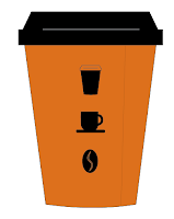
I got my layout pad to sketch up some ideas for how I could have my take away cups to look.
SCAN SHEET IN
Then I figured, everything that I am using is digitised so I could just mock up some ideas on Illustrator on to the icon that I made for the cup - quicker and better because I'll be using the actual design elements. I changed the icon to be how the basic look of the cup will be (this was discussed and decided in the meeting with the owner).
Using this then, I added stuff to it.
I tried to give the impression of it being embossed on the ones below.
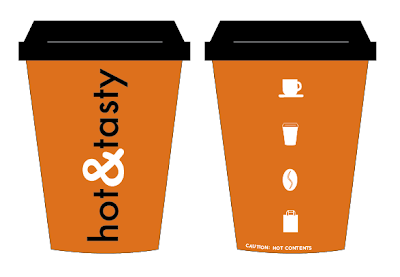
Considering that the owner said something about having the icons 'down the spine of the cup' I figured this would mean in a vertical line, so I experimented with this. I weren't sure which icons to use. I looked at producing one that would represent hot contents but couldn't really think of anything to do for this. I also had a quick try with them horizontal too, but definitely prefer vertical.
I like the idea of having these two things that I have experimented with go around the cup, and be repeated on the opposite side to each other. So using the vectors and what not I tried to represent these on the digitised mock ups.
Showing each angle of the cup with the design going around.
I'm not sure if this would look too much? So did the same again but this time using each bit just once, that will be on opposite sides of the cup.
I like this idea, then wondered if using the actual logo instead of just the & symbol would work. I mocked these up showing the different sides.
Considering that the logo takes up less area than the symbol, I had another look at doing it repeated so that the same thing is on opposite sides of the cup.
I put this onto individual cups to show each angle of the cup and how it would appear.
I like this, but not sure whether I prefer just the symbol instead. I'll see.


No comments:
Post a Comment