Friday, 25 May 2012
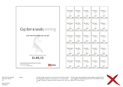
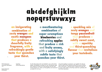
YCN Individual Submission Boards
Here are my individual submission boards for the YCN Feel Good collaborative brief I did with Beth Yates.
Smoking - Lighters 2
I looked back over the lighters designs that I have developed, and decided to tweak the last one slightly as I do believe that it does need the logo. I am happy with the quick impulsive decision I made with this, and so this is now my finished lighter design.
Smoking - Web Banners
Depending on the website, web banners are different shapes and sizes. I have decided to produce a few different ones that could appear on potential websites and then will design them accordingly.
The first website I'll do one for is the BBC news website - they have a nice decent sized square ad on the right of their page.
The first website I'll do one for is the BBC news website - they have a nice decent sized square ad on the right of their page.
There's 3 key bits of information that I want to include
- suggestion
- how long line
- date
So I will have 3 major changes to the ad, as I don't just want a static one. The three changes are
The transition between the three key frames will be that one will fade out and then the next one will fade in. Each will be on screen for around 3 seconds before the change.
Due to me centering everything on everything I have produced previously, it makes sense to just do that with this as well rather than experimenting with the positioning as I want to try and keep everything as visually consistent as possible.
I also want to include a smoke effect in the design. Although this would most likely suit just being static, I think it would be more interesting and attention catching if it was to move. So during the time that it takes to transition between each key frame, the smoke effect will rise in the background the whole time.
OOPS! I have forgot to include the logo in this design. I will add it as an extra key frame to the end after the date.
The range for this could also vary between the suggestions and the different smoke effects.
In context.
Creative Review have an horizontal ad space at the top of their website.
I'm going to basically copy what I have done for the previous one, but this time to fit within this ad space.
In context.
Smoking - Beer Mats 2
Now that the posters finished, I came back to the beer mat designs I made and am happy with the last one I ended up doing. I tweaked it a little by centering the how long line, but other than that I believe it's finished. Here is how this looks. Again, as with the posters, I could make these into a range by having different suggestions on each, then when they are put onto tables in pubs there will be a variety on each table rather than just the one.
Smoking - Posters 2
I have now decided on the description that I will use to support things I produce, such as the posters. This is
- Over time, smoking becomes as much of a learned behaviour as it is an addiction. World No Tobacco Day is all about ignoring those nicotine cravings, and seeing how long you can go without a cigarette.
So I can now develop my poster that I have so far further. I skimmed back over the development of what I did previously and picked out elements that I liked from each, and will use this now to help me develop it further. I prefer the ones that have the centered information rather than the ones with the left justified information, so I will edit it back to this, as well as play around with small details to ensure it is to the right standard.
I am pleased with the end result to the posters, and I believe that this is a design that could be scaled to any size really. So I could use it as an A4 poster to go on the beck of a toilet door, or push up to being the size of a bus stop adshell.
I can make a full range of these by altering the suggestion lines.
An additional range that I could do on top of this, is to have the smoke effects different as well. I could have the different smoke effects on the different posters with the different suggestions.
All.
Subscribe to:
Comments (Atom)


