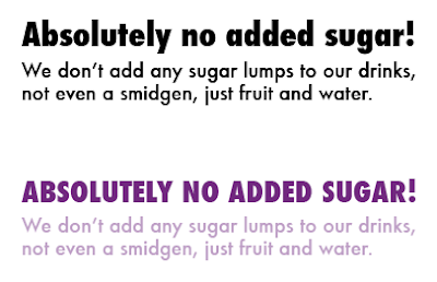
For things such as the bottle labels, and any other information which will be used on anything that we produce, we need to decide on a typeface to accompany the description typeface. I experimented with a variety to see which would suit it best. I used a bit of information that was on one of the bottles to do this.
I selected a few to try out with more of a title to go with it, in both black and a colour.
Whilst I think either would work for their own reasons, I prefer the top one which is Futura. I think I'm drawn to this one because the description typeface I developed was from this typeface also so it's guaranteed to work together. Me and Beth both decided then that this would be the best one to use and is what we will.


No comments:
Post a Comment