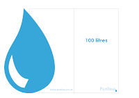
To develop the receipt holder, I first concentrated on the outside of it. Before I really started with anything, I put an outline of the water drop on to the net that I have made up using the measurements of the receipt holder I have from Schuh and printed this out to both ensure that the size is alright, and that the water drop is in the correct position to fold around on to the inside of the holder to hold the receipt in place like the flap does on the Schuh one does.
I think this works well, and makes what could essentially be a piece of quite boring design look that bit more interesting. So then I started developing the ideas that I have sketched.
Not really feeling what I have done so far, it's as though there is just something missing or what ever, so I decided to experiment with a different approach by rotating the logo.
I printed the design out at this stage to see how it sits on the page. I am not entirely sure about the your receipt part of it as it looks a bit big. I have put this under the 'tee' section of the logo as if to say it is the receipt for the tee that has just been bought.
I experimented with different ways that I could have this small aspect of the holder. Also, I have decided to experiment with having the whole back of the holder blue as opposed to having the other half of the shape of the water drop. As soon as I did this it made more sense for me to have.
I printed out a couple more examples of ways for me to have the your receipt section on the holder but I don't think that it looks quite right as it is. The text itself needs to be smaller for a start, and the experiment with the bold text and at a tint just doesn't look right at all so I will avoid doing this.
I moved the text down so that it lines up with the start of the logo rather than sitting under 'tee'. This works a lot better as I think it makes it just look more balanced. So I experimented with the size and weight of this then until I was happy
After multiple tries as shown, I am not happy with what I have ended up with for this, and will have the outside of the receipt holder design to be like this:


No comments:
Post a Comment