I quite like how this illustration has turned out. The sketchy shading I captured with the graphics tablet gives it a sort of hand made look to it, so it looks like more time and effort has gone into it which could reflect on the company as it could suggest that they also put time and effort into making sure things are done right for that. Even so, I have said from the start that this isn't a charity it's a movement and I want to avoid using guilt trip imagery to persuade people to be involved with it, I want them to be involved because they want to be. I will still take this to the crit to see what Lorenzo and the rest of the group agree with.
do typeface experiment if have time
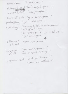
I think with each of the things that I produce, what they say could be influenced by where they will be sort of thing, I wrote some examples down quick to also take along to the crit with me.
Also I took to the crit my logo developments and part of my purest blue experiments to use as examples whilst explaining my project.


No comments:
Post a Comment