
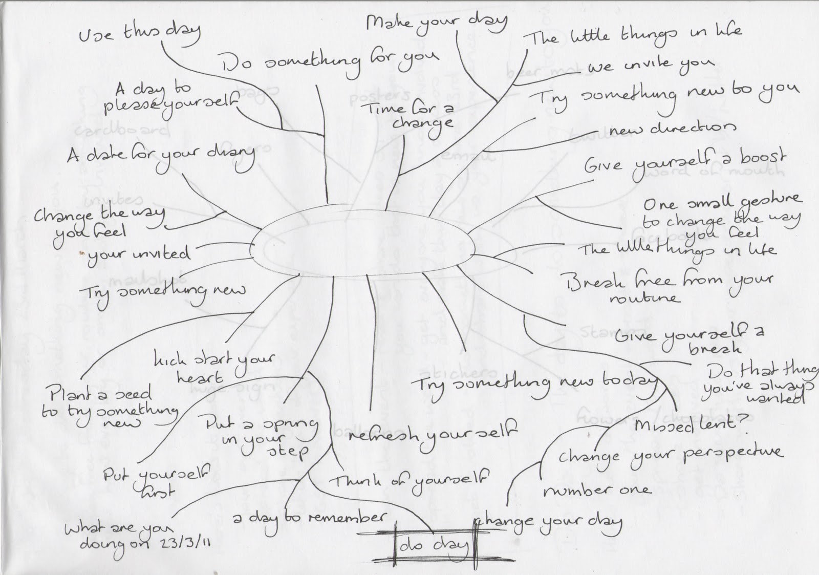
We came up with as many different ones we could think of, and the one that we all decided on as a group that we felt would work the best, and had the best ring to it was Do Day. This is because it is simple and straight to the point, and is something short and more likely to stick in your head.
Once this was decided, we were thinking up of as much of a variety of different ways we could think of to possibly distribute the whole Do Day event. I noted these down on a mind map also.

We want to distribute the message about the event as well as we can, so we will be sure to consider as many possibilities as we can in the time we have to complete the brief before the actual Do Day itself.
Dom put together some quick designs on how the logo for the event could look, and everyone instantly liked it and thought it would work well. It is simple, and straight to the point, and also doesn't look 'too serious' so I think it will work with the audience well and get them to respond to it better.
Thinking about the colour of it, orange was decided as a good colour to use because it's bright and positive, and can appear more light hearted and engaging. A simple shape was also decided on to keep with this feel.


Thinking about the colour of it, orange was decided as a good colour to use because it's bright and positive, and can appear more light hearted and engaging. A simple shape was also decided on to keep with this feel.


It was decided that rather than using just a standard plain white paper stock to print on, we would use the brown cardboard textured paper. This is because we want to keep the project looking more rustic, and printing on to it will appear that bit more hand made and thought out.
For the main flyers that we could possibly go out and stand in a busy part of leeds to hand out, we thought it would be interesting to print on to some corrugated cardboard, rather than just paper. This is because we feel it would be that little more engaging for the person receiving it and will be more likely to take notice of it because it wouldn't be 'just another flyer'. To be able to print on to this would mean to go and do it in screen printing.


The logo was tried out using white, and this does look pretty awesome really. Although to be able to produce everything using white it would only be possible to do it using screen print, as you cannot print using white ink from a normal printer. This would prove to be a little too time consuming to do, so it will have to be more considered. In the end, we decided to stick to using the orange colour originally selected.

Lisa printed out a colour test using the laser printers in the mac suite trying out a mixture of colours, as well as experimenting with the name in upper and lower case letters. I think looking at both, the uppercase ones work better than the lowercase ones because it has more impact. Everyone as a group agreed with this, so this will be which we use.

The yellow is the least effective of the colours experimented with as you can barely even read what it says. I quite like the green and the orange/red that we originally experimented with. As a group we decided to go with the original colour.
No comments:
Post a Comment