Whilst in one of the Visual Language sessions, using printed versions of the photos I collected that had the letter A within them, I drew all the lines together to make them look like random lines until you look closer and noticed that there is lots of little A's within it. I really like this idea.
I put a book together using similar to this on the back and then had it running through the pages but I didn't really like how it turned out, so I changed my idea.
I found a quote whilst researching for another brief:
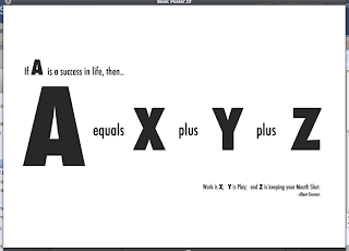
"If A is a success in life, then A equals X plus Y plus Z. Work is X; Y is play; and Z is keeping your mouth shut."
I found it amusing and it links with the letter A so I decided to take a typographic approach and put it together.
The final designs are:
Once I was happy with the the end designs of the hotdog books, I printed them out on a whole variety of stocks to see what it works the best on, rather than choosing just a normal stock.
Out of them all I liked the version on the blue paper and the grey paper, so I asked the opinions from people I am around all the time to see which they prefer the best.
I decided to go with the grey stock as I felt this worked that bit better than the blue one, so I went on to produce 10 of these which were then submitted to the book fair.


No comments:
Post a Comment