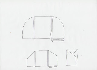
I sketched down a variety of possibilities for having the folders made from paper.
Whilst sketching, I really latched on to the idea of having a sort of folder box, so that it would be really easy to slot paper in and out when required. I came up with a few ways of doing this, but when I did the sketch of what they would be like all stood together, it got me to thinking just how much room it would take up in the 'pack' if I was to do this. It works out if I were to have the depth of each of them to just 2cm each, this still adds up to being 14cm wide when they are all together. I want to keep the pack to a manageable size and not make it into a full on box, so because of this I hit a hurdle with the folders.
Alternatives
An alternative I believe would sort of do the same job would be to make just one folder for the student to carry with them, or keep in their draw or at home where every brief and handout and what ever else is given to them goes. This does still solve the problem of keeping them all in one place, but doesn't really keep it organised within it, so you would have to go routing through it all to find the thing you need.
I think the folders that you can get where they have separate sections within the folder are really ugly, and I don't think it would really be appealing so I immediately discarded this idea. Also because once I start doing that it will soon bulk up the depth of it.
Reflecting back over the sketches, I got to thinking about the folders that they give out at school, where they are flat but have creases in them, so that when they start to get full they fold out so that things can fit. These folders are quite ugly, but would be a good way of solving my problem. I just need to think of a way to make them more desirable to use/take notice of.
Another alternative I thought of was that because the OUGD101, OUGD102, and OUGD103 modules run one after another, this could eliminate two of the folders if I was to make this folder so that one is used for all three. It's a possibility.
'Flat pack' folders
Going back to the idea to be similar to the kind of folders they give at school, a good way I thought of to make them a bit cooler would be to have them portrait instead of landscape, so I guessed real quick a net on how to do this, and had a go at making one out of layout paper. I learnt two lessons from this, 1 - I need to definitely measure things out before I make them to save wasting time (as it just didn't turn out right at all) and 2 - do not use layout paper again to experiment at folding things such as paper folders with again.
I left the folder thing for a while after this so that I could come back to it with fresh thinking, and once I started thinking about it again I pretty much realised the above idea is pants. Even so, I still want to go with the portrait folder that is sort of like a flat pack, just not have it look like that. So I started sketching ideas again and then developed this on to the possible idea.
I quite like the idea that I have ended up with at the end, I will develop this slightly depending on what fits best, but I think if the design I use on it is done to a hugh standard it could turn out to look really good.
I experimented quickly with some layout paper with the folded sections of the folder that will make it into a flat pack folder. I did it with the inside section so that I could just use an A4 sheet. It turned out well and gave me a really good idea for what needs to be done for this.
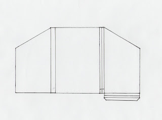
I then started to put together some nets for me to follow for the folder for once I start designing it.
I am happy with how the last net is and this will be what I use. I picked up the first copy of a net that I came to and photocopied it to work out the actual size for it.
Whilst this size would be ideal, I have to think about being able to print it, and keeping the cost down as I will have to print it numerous times. A way to get around it would be to print the design separate and stick it on but that wouldn't look very professional.
I made some mock ups of the folders to make sure that the measurements are right, and also to see what stock I should use. I experimented with the higher gsm stocks from the samples I have, as well as one with some mount board. The one that works the best is the card from the library.


No comments:
Post a Comment