As the book is pretty much finished, just the last check through and what not to get done and Jo and Amber didn't find fault with it, I were advised to experiment with how I could expand the information within the book. One key thing I remember them saying was that to read a book is a lot of information presented in front of you all at once and to maybe try experiment with getting across maybe some bite size chunks of the information as well as the book.
I looked back over the initial ideas I got for this brief, and with the Visual Language book fair fresh in my mind I pretty much immediately thought of giving it a go at making some mini books using the 'hot dog' fold technique which will have just a section of the facts from the book. For example, one could maybe be on the countries, another on the types of drinks, etc.
Size
I want the mini books to stay at a small size, because I want them to be bite size information, so once it is folded it won't allow me to put too much into one thing. I think this will also help to keep it to a minimum to hopefully make the reader want to read more from somewhere, and ultimately want a book as this is the main product I am producing.
The size of each of the pages from folding a A4 piece of paper using the technique makes them into A7 size (105mm x 74mm). This is a good pocket size and would be easy to just pick up and hold on to so this will be the size that I will produce the mini books to. If I were to make them from A3 paper, each of the pages in the mini book from that would be A6 sizes (148mm x 105mm), and I don't think working to this scale for what I am wanting to achieve will have the same effect.
Categories
I have looked through my book, and counted how many categories I could use from it that I think would fit into one of these mini books without having too much or too little information. These include:
- Coffee Countries
- Coffee Beans
- Coffee Drinks
- Coffee Bean Process
- Other Uses
- Advantages/Disadvantages
- Coffee Machines (maybe)
There will be at least 6 of these mini books that I can potentially produce, and I want them to work as a set so that say if someone has seen one of the mini books, and a week later see a different one they would recognise it more due to the one they have already seen. Therefore, I will make the front and back covers for each of the mini books the same as each others, but have small elements of them different such as the category titles and images relating to them, so that each one still stays unique, but also works as part of the set.
Front Cover
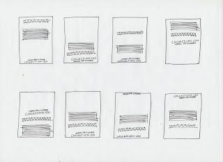
I want to keep the front covers of them simple, so I will keep the content of it down to simply having the books title, category of facts that the book is on title, and an image relating to the category. I have drawn out some simple layouts experimenting with the composition of this.
The design of the front cover will be like this, but will obviously have the right category name and an illustration in the gap that is relevant to what the book is about.
Back Cover
I want to use basically the same rule as I have for the front cover for the back cover, keeping it simple. Therefore I will have the Collection 100 and my name section on it, like I do on the back of the actual book. As well as a short paragraph explaining there is more of these interesting facts available to read, and maybe direct them to a website where they can access this information. I put together some layout experiments for how I could have the back cover.
The design of the back cover will be like this on each of the mini books.
Coffee Countries
Now that I have the layout of how I want to have the front and back covers to the mini books I mapped out the general layout of what the book is when it is not folded together to see what page goes where to ensure it will fold int the right order and make sense. I then basically took the information from the book that I have (for this one for example) the Coffee Countries category and interpreted it into the book, playing around with the layout of it until I felt satisfied it worked effectively. Here is how it ended up:
When it is printed and has been folded it looks like this:
Coffee Beans
Using the same process as I did for the coffee countries, I experimented with the layout on the mac for this mini book as well, and will do the same for each of the other individual mini books too.
Here is the layout I ended up with for this mini book:
Once it'd been printed and folded it looks like this:
Coffee Drinks
The layout for this mini book ended up like this after experimenting:
When printed and folded it looks like this:
Coffee Bean Process
The layout of the mini book for the coffee bean process looks like this:
When printed it looks like this:
Other Coffee Uses
The layout looks like this:
AFter it was printed and folded it looks like this:
Coffee Advantages/Disadvantages
Layout:
When printed and folded:
Experiments
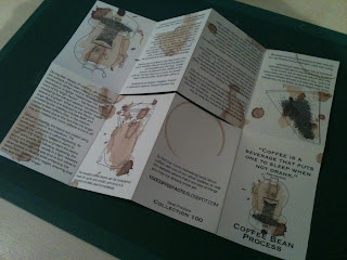
Whilst I was experimenting with the layouts for these mini books every so often I would print them to see how they were looking and if they were working. Here is some of the experimented books I made to see:
As well as these there were a variety of others, and I have just took a picture of these ones all together rather than taking photos of every single page because I don't think seeing every slight change would be too interesting.
Posters
When I started these designs, my intentions was that each mini book would have it's own unique poster on the reverse side of them when folded out relevant to what the book was about, and then they would be collectable as a set (for anyone like me who would stick them to their walls). I did start doing this, and produced a few of them, but time has ran away with itself, which I am genuinely gutted about because in order to get everything finished for the module on time I am having to sacrifice this. It would definitely be something I would do if given the chance to improve on the project, or if for some miraculous reason I got an additional day.
So because of this I have put together a general poster that will go on the back of each of them containing the quote that I have used on the front of the book and what not. On these it will be done landscape, so I have also included a few extra coffee splats and what not to make them that bit more interesting.
Here is how the poster looks:
Belly Band
To hold all of the mini books together if the person receiving them was to get them as a complete set, I have decided to design a belly band for them, similar to the one around my book but going completely round to hold them together. I will print it on the same brown paper so that they link together more as a whole project.
I basically just want it to have the quote on it, as it doesn't need any explanation because they pretty much explain themselves. Here is how it will look:
When I came to printing the belly band, my printed decided to not work properly and kept jamming the brown paper, so as a result of this I have printed it on white. It still does the job it is intended to do and looks probably just as good.


No comments:
Post a Comment